Found a total of 10000 related content

How to make a parallax scrolling effect with HTML5?
Article Introduction:To realize the parallax scrolling effect in HTML5, you need to combine HTML, CSS and JavaScript. The core is to allow different page elements to scroll at different speeds. 1. The HTML structure should contain multiple independent layers, such as using different class names to represent background, intermediate content and foreground. 2. CSS uses position:absolute and translateZ to create a 3D depth sense. The smaller the value of the background layer, the slower the scrolling. 3. JavaScript can listen to scroll events, dynamically adjust the translateY value, and control the scroll speed of each layer by multiplying by a coefficient. 4. Pay attention to performance optimization and use requestAnimationFrame
2025-07-15
comment 0
759

How to create a parallax effect with HTML5
Article Introduction:The easiest way to create a parallax effect is to use the background-attachment:fixed attribute of CSS, which creates a depth illusion by fixing the background image and scrolling the content, and can achieve the basic effect without JavaScript; if you need to control the movement speed more carefully or adapt to mobile devices, you can combine JavaScript to listen to scroll events and dynamically adjust the background position, such as setting the Y-axis position of the background to half of the scroll offset to achieve half-speed movement; in order to improve the experience, you should optimize the background image size, provide a downgrade solution on the mobile side, adopt a semantic HTML structure, and consider using prefers-reduced-motion media query to meet different user needs.
2025-08-24
comment 0
917

How to create a responsive image gallery with CSS
Article Introduction:Use CSSGrid to easily create responsive picture galleries without JavaScript; 1. Use .gallery{display:grid;grid-template-columns:repeat(auto-fit,minmax(200px,1fr));gap:10px;padding:10px;} to achieve adaptive mesh layout; 2. Set width:100% for the picture; height:auto;object-fit:cover;border-radius:8px; to ensure responsiveness and visual consistency; 3. Optional add:hover zoom effect to improve the interaction body
2025-08-11
comment 0
343

How to create a responsive video grid in HTML5
Article Introduction:Use HTML5 elements to build a video grid in the container, and each video is wrapped with a div; 2. Use CSSGrid to set display:grid and grid-template-columns:repeat(auto-fit,minmax(300px,1fr)) to achieve responsive layout; 3. Maintain a 16:9 aspect ratio through object-fit or padding-bottom:56.25%; 4. Avoid automatic playback, add controls and posters to ensure mobile availability; and finally realize a cross-device responsive video grid without JavaScript through modern CSS.
2025-08-11
comment 0
678
How to create a split-screen layout with CSS?
Article Introduction:Using Flexbox, you can achieve equal-wide split-screen layout by setting container display:flex and child element flex:1; 2. Using CSSGrid can define two columns through grid-template-columns:1fr1fr to achieve the same effect; both of them fill the viewport with height:100vh, and a mobile stacked responsive layout can be achieved through media query, ultimately achieving a simple and flexible split-screen design.
2025-08-05
comment 0
306

How to create a simple accordion with HTML5
Article Introduction:Using HTML5 and elements, you can easily create a simple accordion effect without JavaScript. After beautifying the style through CSS, you can expand and collapse the content. It supports accessibility and responsive design natively. If you need to expand only one panel and other advanced controls, you can add a small amount of JavaScript for enhancement, ultimately implementing a lightweight, semantic and well-compatible interactive component.
2025-09-07
comment 0
204
12 jQuery Fullscreen Plugins
Article Introduction:12 amazing jQuery full screen plug-ins to create a fascinating website!
Sometimes, full-screen websites are really cool! If a website looks plain, how long do you think visitors will stay? So, we have prepared some good stuff to help you: 12 jQuery full-screen plugins that give your website a stunning full-screen responsive effect! These plugins will add extraordinary visuals to your website. Ready?
Related recommendations:
100 jQuery picture/content slider plug-ins
30 jQuery responsive layout plug-ins
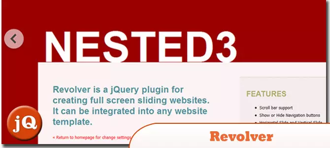
Revolver
A jQuery plugin for creating full-screen sliding websites. It can be integrated into any website template.
Source code
2025-02-25
comment 0
617
How to create a responsive product grid in CSS
Article Introduction:Use CSSGrid to create a responsive product grid, and implement adaptive layout through display:grid and grid-template-columns:repeat(auto-fit,minmax(250px,1fr)); 2. Set the gap attribute to ensure consistent project spacing; 3. Add styles to each product to form a card effect, including borders, rounded corners, margins and shadows; 4. Optionally use media queries to further control the number of columns under a specific screen size; 5. The complete example includes HTML structure, CSS layout and responsive design to ensure that it can be displayed well on different devices, and ultimately implement a screen change without JavaScript and CSS only
2025-08-15
comment 0
579

CSS Grid layout practice: The secret to building an efficient web structure
Article Introduction:This tutorial explores in-depth how to use HTML and CSS Grid layouts to build efficient and responsive web structures. We will focus on the core properties of CSS Grid, such as display: grid and grid-template-areas, and demonstrate how to define grid areas through actual examples. At the same time, the importance of correct HTML tag closure for normal rendering of CSS Grid is emphasized, helping beginners avoid common mistakes and achieve the expected page layout effect.
2025-08-30
comment 0
736
How to create a responsive photo gallery with CSS Grid?
Article Introduction:Create a div container containing semantic figure and figcaption elements as a gallery structure; 2. Use display:grid and grid-template-columns:repeat(auto-fit,minmax(250px,1fr)) to implement responsive grid layout; 3. Make sure the image is adaptable and neatly cropped by setting img width:100% and object-fit:cover, while adding styles to figcaption to improve readability; 4. Optionally add the hover effect of transform and filter to enhance the interactive experience; ultimately no JavaScript is required
2025-08-23
comment 0
558
Implementing advanced layouts with CSS Grid techniques
Article Introduction:To use CSSGrid to implement advanced layouts, the key is to master its structural control and positioning methods. First, use grid-template-areas to build a semantic layout, such as the "head sidebar content area bottom" structure; second, through grid-column and grid-row, the element position can be accurately controlled, so that the card can span multiple columns or rows; then, combine minmax() and auto-fit to create a responsive grid, and automatically adjust the number of columns; finally, use cascade layout and z-index to control the element level to achieve a floating effect. These techniques can address complex and responsive web design needs.
2025-07-14
comment 0
686
css image gallery layout example
Article Introduction:This is a responsive picture gallery created using CSSGrid, which can automatically adapt to different screen sizes; 1. The adaptive number of columns is achieved through grid-template-columns:repeat(auto-fit,minmax(200px,1fr)) to ensure that each column is at least 200px and the monospace is filled; 2. All pictures are set to a fixed height of 200px and use object-fit:cover to maintain proportional cropping to ensure visual uniformity; 3. Add the hover effect of transform:scale(1.05) and achieve smooth animation with transition; you can also adjust the spacing on the small screen through media query, and the overall layout is responsive without media.
2025-07-31
comment 0
988

How to write a basic HTML5 page template?
Article Introduction:Declare the document as HTML5 to avoid the browser from entering weird mode; 2. Define the root element and specify the language to improve accessibility and SEO; 3. It includes ensuring correct character encoding, implementing responsive design, and setting page title; 4. Place all visible content, optionally add CSS, favicon and JavaScript links; this template is complete and compatible with modern browsers, and is suitable for any new HTML file.
2025-07-26
comment 0
1040

How to use computed properties with Composition API?
Article Introduction:In Vue3's Composition API, the computed function can be used to implement responsive computed properties; 1. The basic writing method is to pass a function that returns a value to create read-only properties, such as computed(()=>count.value*2); 2. When it is necessary to be readable and writable, you can use the object form with get and set, such as updating the firstName and lastName by assigning fullName.value; 3. There is no need to add .value when used in the template, Vue will automatically unpack; computed is more suitable for derived values, and watch is suitable for side effect operations. Reasonable choice can improve the simplicity of the code and the clarity of responsive logic.
2025-07-03
comment 0
627
How to create a responsive image gallery with CSS?
Article Introduction:Using CSSGrid is the best way to create a responsive image library. 1. Use CSSGrid layout to implement adaptive grids through display:grid, grid-template-columns:repeat(auto-fit,minmax(200px,1fr)) and gap; 2. Optionally add media queries to accurately control the number of columns at different breakpoints, such as the small screen set to 1 column and the flat panel set to 2 columns; 3. Optimize image performance, adjust the size reasonably, use WebP format and combine srcset to achieve responsive loading; in addition, you can try multi-column layout to simulate the waterfall flow effect, but it is recommended to use the main Grid solution, which does not require JavaScript, is highly adaptable and dimensional.
2025-08-03
comment 0
715
How to create a responsive team showcase with CSS?
Article Introduction:Use semantic HTML structure team member information, and each member uses a class as a div to wrap it with a class; 2. Use CSSGrid layout to realize a responsive grid through grid-template-columns:repeat(auto-fit,minmax(280px,1fr)) to ensure that the number of columns is automatically adjusted on different devices; 3. Follow the principle of mobile priority and optimize the display effect of small screens in conjunction with media queries; 4. Improve accessibility, including image alt text, correct title level and keyboard navigation focus style; 5. Add fade-in animation to enhance the visual experience, and achieve the fade-in effect of member cards one by one through animation. Final reality
2025-08-05
comment 0
542

How to create a 'broken' grid layout with CSS Grid?
Article Introduction:Use grid-template-columns to create a responsive basic grid with flexible units; 2. Use grid-column and grid-row to control the alignment of specific elements across columns or offset positions; 3. Use negative margins and z-index to achieve overlapping or staggered visual hierarchy; 4. Use grid-template-areas to define irregular layout areas to achieve complex structures; 5. Use justify-self or align-self to adjust the alignment of individual elements to create asymmetry; 6. Use media queries to maintain intentional misalignment effect on different screens; pay attention to controlling the degree of breaking, maintaining readability, making good use of white space and multi-end tests to achieve design-sensible non-design
2025-08-29
comment 0
282

How to create a responsive grid of logos with CSS?
Article Introduction:Create a responsive logo grid with CSSGrid through the following steps: 1. Use display:grid and grid-template-columns:repeat(auto-fit,minmax(150px,1fr)) to create an adaptive column layout to ensure that it is evenly distributed and automatically wrapping lines under different screen sizes; 2. Center the logo through the flex layout in the .logo-item, and set a fixed height and background color to unify the visual effect; 3. Set max-width, max-height and object-fit:contain for the image to maintain the proportion without overflow; 4. Optionally add media queries,
2025-08-05
comment 0
312
5 jQuery Background Video Plugins
Article Introduction:Five excellent jQuery background video plug-ins are recommended to easily create a cool website!
Many websites use pictures as backgrounds, and the effect is very cool. Since you can use pictures, why not use videos? This article will recommend five powerful jQuery background video plug-ins to help you easily videotape your website or blog background! Ready? Let's get started! Related readings:
Top 10 jQuery and HTML5 media players
jQuery parallax tutorial—animation title background
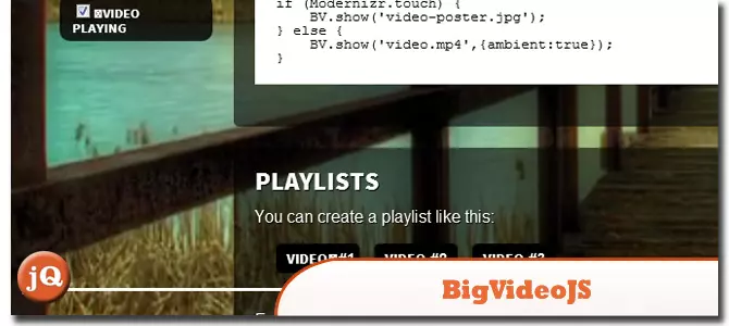
BIGVIDEO.JS
This plugin makes it a breeze to add adaptively populated background videos. It can play muted atmosphere background video (or a series of videos) or it can also be used as a player to display video playback
2025-02-25
comment 0
811

Building HTML Email Templates
Article Introduction:The HTML mail template must be based on compatibility. 1. Use basic tags such as table, tr, and td layout to avoid HTML5 semantic tags; 2. Inline styles must be used to ensure that CSS takes effect; 3. Images are only auxiliary, and key information is presented in text; 4. The buttons are recommended to use styled A tags or tables; 5. After completion, tests must be performed on multiple clients to ensure that the display is normal.
2025-07-30
comment 0
491
