


Image Swap in Pure CSS
Let's create Image Swap tutorial in Pure CSS without using JavaScript.
- Let's create few elements in html using input radios, labels. At the end, also let's add **
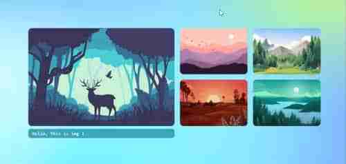
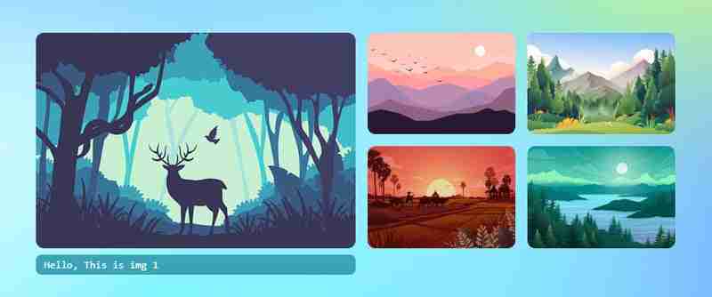
<div>


<p>Let's create <strong>CSS</strong><br>
</p>

<pre class="brush:php;toolbar:false"> * {
    margin: 0;
    padding: 0;
}

html {
    height: 100%;
    scroll-behavior: smooth;
}

body {
    display: flex;
    flex-direction: column;
    height: 100%;
    font-family: monospace;
    place-content: center;
    background-size: 100% 100%;
    background-position: 0px 0px;
    background-image: radial-gradient(18% 28% at 24% 50%, #CEFAFFFF 7%,
 #073AFF00 100%), radial-gradient(18% 28% at 18% 71%, #FFFFFF59 6%,
#073AFF00 100%), radial-gradient(70% 53% at 36% 76%, #73F2FFFF 0%,
#073AFF00 100%), radial-gradient(42% 53% at 15% 94%, #FFFFFFFF 7%,
 #073AFF00 100%), radial-gradient(42% 53% at 34% 72%, #FFFFFFFF 7%,
 #073AFF00 100%), radial-gradient(18% 28% at 35% 87%, #FFFFFFFF 7%,
 #073AFF00 100%), radial-gradient(31% 43% at 7% 98%, #FFFFFFFF 24%,
 #073AFF00 100%), radial-gradient(21% 37% at 72% 23%, #D3FF6D9C 24%,
 #073AFF00 100%), radial-gradient(35% 56% at 91% 74%, #8A4FFFF5 9%,
 #073AFF00 100%), radial-gradient(74% 86% at 67% 38%, #84d9ff 24%,
 #073AFF00 100%), linear-gradient(125deg, #4EB5FFFF 1%, #4C00FCFF 100%);
}

.wrapper {
    width: 860px;
    height: 283px;
    position: relative;
    margin: 0 auto;
}

.wrapper label {
    width: 200px;
    height: 134px;
    cursor: pointer;
    position: absolute;
    transition: 0.25s;
    border-radius: 10px;
}

.wrapper label img{
    max-width: 100%;
    height: 100%;
    border-radius: 10px;
}

.wrapper input[type="radio"] {
    padding: 5px 5px 5px 10px;
    height: 134px;
    width: 200px;
    cursor: pointer;
    position: absolute;
    z-index: -1;
    opacity: 0;
}

.wrapper input[type="radio"]+label span {
    opacity: 0;
    background: var(--bg);
    display: inline-block;
    border-radius: 7px;
    padding: 5px 0 5px 10px;
    margin-top: 5px;
    width: calc(100% - 10px);
    color: white;
}

.wrapper input[type="radio"]:checked+label span {
    opacity: 1;
    animation-delay: 1s;
    animation: fade 1s;
}

/* static positions */
.wrapper input[type="radio"]#s1,
.wrapper input[type="radio"]#s1+label {
    left: 0;
    top: 0;
}

.wrapper input[type="radio"]#s2,
.wrapper input[type="radio"]#s2+label {
    left: 440px;
    top: 0;
}

.wrapper input[type="radio"]#s3,
.wrapper input[type="radio"]#s3+label {
    left: 655px;
    top: 0;
}

.wrapper input[type="radio"]#s4,
.wrapper input[type="radio"]#s4+label {
    left: 440px;
    top: 150px;
}

.wrapper input[type="radio"]#s5,
.wrapper input[type="radio"]#s5+label {
    left: 655px;
    top: 150px;
}

/* onclick shows large image and caption*/
.wrapper input[type="radio"]:checked,
.wrapper input[type="radio"]:checked+label {
    left: 0 !important;
    top: 0 !important;
    width: 425px;
    height: 100%;
}

/* placing first item position when clickced on other thumbnails */
.wrapper input[type="radio"]#s2:checked~#s1+label {
    left: 440px;
}

.wrapper input[type="radio"]#s3:checked~#s1+label {
    left: 660px;
}

.wrapper input[type="radio"]#s4:checked~#s1+label {
    left: 440px;
    top: 150px;
}

.wrapper input[type="radio"]#s5:checked~#s1+label {
    left: 660px;
    top: 150px;
}

@keyframes fade {
    from {
        opacity: 0;
    }

    to {
        opacity: 1;
    }
}

/* changing background color when clicked on thumbnails */
.bg {
    position: fixed;
    left: 0;
    top: 0;
    width: 100vw;
    height: 100vh;
    z-index: -1;
}

.wrapper input[type="radio"]#s2:checked~.bg {
    background-image: radial-gradient(circle, rgba(238, 174, 202, 1) 0%, rgba(148, 187, 233, 1) 100%);
}

.wrapper input[type="radio"]#s3:checked~.bg {
    background-image: radial-gradient(circle, rgb(197, 218, 196) 0%, rgb(88, 167, 204) 100%);
}

.wrapper input[type="radio"]#s4:checked~.bg {
    background-image: radial-gradient(circle, rgb(238, 226, 174) 0%, rgb(177, 139, 131) 100%);
}

.wrapper input[type="radio"]#s5:checked~.bg {
    background-image: radial-gradient(circle, rgb(174, 238, 225) 0%, rgb(36, 163, 136) 100%);
}
Now, we have done the swap animations with static positions. Check the output in below gif animation if it plays else go to the end of this article and view the codepen link for demo.

Now let's try with dynamic width and height using CSS custom variables. Using custom css variables is very useful because just by changing at only 2 places, all the sizes(large and thumbnails) including gaps will get automatically fixed. Let's create variables in :root
 :root {
     --w: 800px;
     --h: 270px;
     --m: 15px;
     --thumbw: calc(var(--w)/4 - 15px);
     --thumbh: calc(50% - var(--m));
     --top: calc(var(--h)/2 + var(--m)/2 + 0px);
 }
Now ignore all the previous CSS and replace with below CSS. You can find below the previous CSS are commented and replaced with custom variables.
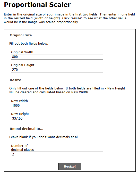
:root {
    --w: 800px;
    --h: 270px;
    --m: 15px;
    --thumbw: calc(var(--w)/4 - 15px);
    --thumbh: calc(50% - var(--m));
    --top: calc(var(--h)/2 + var(--m)/2 + 0px);
}

 * {
     margin: 0;
     padding: 0;
 }

 html {
     height: 100%;
     scroll-behavior: smooth;
 }

body {
    display: flex;
    flex-direction: column;
    height: 100%;
    font-family: monospace;
    place-content: center;
    background-size: 100% 100%;
    background-position: 0px 0px;
    background-image: radial-gradient(18% 28% at 24% 50%, #CEFAFFFF 7%,
 #073AFF00 100%), radial-gradient(18% 28% at 18% 71%, #FFFFFF59 6%,
#073AFF00 100%), radial-gradient(70% 53% at 36% 76%, #73F2FFFF 0%,
#073AFF00 100%), radial-gradient(42% 53% at 15% 94%, #FFFFFFFF 7%,
 #073AFF00 100%), radial-gradient(42% 53% at 34% 72%, #FFFFFFFF 7%,
 #073AFF00 100%), radial-gradient(18% 28% at 35% 87%, #FFFFFFFF 7%,
 #073AFF00 100%), radial-gradient(31% 43% at 7% 98%, #FFFFFFFF 24%,
 #073AFF00 100%), radial-gradient(21% 37% at 72% 23%, #D3FF6D9C 24%,
 #073AFF00 100%), radial-gradient(35% 56% at 91% 74%, #8A4FFFF5 9%,
 #073AFF00 100%), radial-gradient(74% 86% at 67% 38%, #84d9ff 24%,
 #073AFF00 100%), linear-gradient(125deg, #4EB5FFFF 1%, #4C00FCFF 100%);
}

 .wrapper {
     /* width: 860px; */
     /* height: 283px; */
     width: var(--w);
     height: var(--h);
     position: relative;
     margin: 0 auto;
 }

 .wrapper label {
     /* width: 200px; */
     width: var(--thumbw);
     height: calc(50% - var(--m) / 2);
     cursor: pointer;
     position: absolute;
     transition: 0.25s;
     border-radius: 10px;
 }

 .wrapper label img,
 .wrapper label div {
     max-width: 100%;
     height: 100%;
     border-radius: 10px;
 }

 .wrapper input[type="radio"] {
     padding: 5px 5px 5px 10px;
      /* width: 200px; */
     /* height: 134px; */
     height: calc(50% - var(--m) / 2);
     width: var(--thumbw);
     cursor: pointer;
     position: absolute;
     z-index: -1;
     opacity: 0;
 }

 .wrapper input[type="radio"]+label span {
     opacity: 0;
     background: var(--bg);
     display: inline-block;
     border-radius: 7px;
     padding: 5px 0 5px 10px;
     margin-top: 5px;
     width: calc(100% - 10px);
     color: white;
 }

 .wrapper input[type="radio"]:checked+label span {
     opacity: 1;
     animation-delay: 1s;
     animation: fade 1s;
 }

 .wrapper input[type="radio"]#s1,
 .wrapper input[type="radio"]#s1+label {
     left: 0;
     top: 0;
 }

 .wrapper input[type="radio"]#s2,
 .wrapper input[type="radio"]#s2+label {
     /* left: 440px; */
     left: calc((var(--w)/2) + var(--m));
     top: 0;
 }

 .wrapper input[type="radio"]#s3,
 .wrapper input[type="radio"]#s3+label {
     /* left: 655px; */
     left: calc(var(--w)/2 + var(--thumbw) + var(--m) + 15px);
     top: 0;
 }

 .wrapper input[type="radio"]#s4,
 .wrapper input[type="radio"]#s4+label {
     /* left: 440px; */
      /* top: 150px; */
     left: calc((var(--w)/2) + var(--m));
     top: var(--top);
 }

 .wrapper input[type="radio"]#s5,
 .wrapper input[type="radio"]#s5+label {
     /* left: 655px; */
      /* top: 150px; */
     left: calc(var(--w)/2 + var(--thumbw) + var(--m) + 15px);
     top: var(--top);
 }

 .wrapper input[type="radio"]:checked,
 .wrapper input[type="radio"]:checked+label {
     left: 0 !important;
     top: 0 !important;
     /* width: 425px; */
     width: calc(var(--w)/2);
     height: 100%;
 }

 .bg {
     position: fixed;
     left: 0;
     top: 0;
     width: 100vw;
     height: 100vh;
     z-index: -1;
 }

 .wrapper input[type="radio"]#s2:checked~#s1+label {
     /* left: 440px; */
     left: calc((var(--w)/2) + var(--m));
 }

 .wrapper input[type="radio"]#s3:checked~#s1+label {
     /* left: 660px; */
     left: calc(var(--w)/2 + var(--thumbw) + var(--m) + 15px);
 }

 .wrapper input[type="radio"]#s4:checked~#s1+label {
     /* left: 440px; */
      /* top: 150px; */
     left: calc((var(--w)/2) + var(--m));
     top: var(--top);
 }

 .wrapper input[type="radio"]#s5:checked~#s1+label {
     /* left: 660px; */
      /* top: 150px; */
     left: calc(var(--w)/2 + var(--thumbw) + var(--m)*2);
     top: var(--top);
 }


 @keyframes fade {
     from {
         opacity: 0;
     }

     to {
         opacity: 1;
     }
 }

 .wrapper input[type="radio"]#s2:checked~.bg {
     background-image: radial-gradient(circle, rgba(238, 174, 202, 1) 0%, rgba(148, 187, 233, 1) 100%);
 }

 .wrapper input[type="radio"]#s3:checked~.bg {
     background-image: radial-gradient(circle, rgb(197, 218, 196) 0%, rgb(88, 167, 204) 100%);
 }

 .wrapper input[type="radio"]#s4:checked~.bg {
     background-image: radial-gradient(circle, rgb(238, 226, 174) 0%, rgb(177, 139, 131) 100%);
 }

 .wrapper input[type="radio"]#s5:checked~.bg {
     background-image: radial-gradient(circle, rgb(174, 238, 225) 0%, rgb(36, 163, 136) 100%);
 }
Now in the :root {--w: 800px; --h: 270px;}. Just change the width and height proportionately. Go to url https://scriptygoddess.com/resources/proportioncalc.htm and type :root width and height shown in below image
Now type new width or height to get proportionate value. I added my new width 1000 and clicked on resize and I got 337.5 as height and I assigned in :root {--w: 1000px; --h: 337.5px;}. That's all you have to do. You can see the change in all images - width, height, gaps increases proportionately.
You can edit the value of width and height in :root in below codepen link and run. Have fun!
Codepen DemoThank you for watching...
The above is the detailed content of Image Swap in Pure CSS. For more information, please follow other related articles on the PHP Chinese website!


Hot AI Tools

Undress AI Tool
Undress images for free

Undresser.AI Undress
AI-powered app for creating realistic nude photos

AI Clothes Remover
Online AI tool for removing clothes from photos.

Clothoff.io
AI clothes remover

Video Face Swap
Swap faces in any video effortlessly with our completely free AI face swap tool!

Hot Article
Hot Tools

Notepad++7.3.1
Easy-to-use and free code editor

SublimeText3 Chinese version
Chinese version, very easy to use

Zend Studio 13.0.1
Powerful PHP integrated development environment

Dreamweaver CS6
Visual web development tools

SublimeText3 Mac version
God-level code editing software (SublimeText3)
Hot Topics


 What is 'render-blocking CSS'?
Jun 24, 2025 am 12:42 AM
What is 'render-blocking CSS'?
Jun 24, 2025 am 12:42 AM
CSS blocks page rendering because browsers view inline and external CSS as key resources by default, especially with imported stylesheets, header large amounts of inline CSS, and unoptimized media query styles. 1. Extract critical CSS and embed it into HTML; 2. Delay loading non-critical CSS through JavaScript; 3. Use media attributes to optimize loading such as print styles; 4. Compress and merge CSS to reduce requests. It is recommended to use tools to extract key CSS, combine rel="preload" asynchronous loading, and use media delayed loading reasonably to avoid excessive splitting and complex script control.
 External vs. Internal CSS: What's the Best Approach?
Jun 20, 2025 am 12:45 AM
External vs. Internal CSS: What's the Best Approach?
Jun 20, 2025 am 12:45 AM
ThebestapproachforCSSdependsontheproject'sspecificneeds.Forlargerprojects,externalCSSisbetterduetomaintainabilityandreusability;forsmallerprojectsorsingle-pageapplications,internalCSSmightbemoresuitable.It'scrucialtobalanceprojectsize,performanceneed
 CSS Case Sensitivity: Understanding What Matters
Jun 20, 2025 am 12:09 AM
CSS Case Sensitivity: Understanding What Matters
Jun 20, 2025 am 12:09 AM
CSSismostlycase-insensitive,butURLsandfontfamilynamesarecase-sensitive.1)Propertiesandvalueslikecolor:red;arenotcase-sensitive.2)URLsmustmatchtheserver'scase,e.g.,/images/Logo.png.3)Fontfamilynameslike'OpenSans'mustbeexact.
 What is Autoprefixer and how does it work?
Jul 02, 2025 am 01:15 AM
What is Autoprefixer and how does it work?
Jul 02, 2025 am 01:15 AM
Autoprefixer is a tool that automatically adds vendor prefixes to CSS attributes based on the target browser scope. 1. It solves the problem of manually maintaining prefixes with errors; 2. Work through the PostCSS plug-in form, parse CSS, analyze attributes that need to be prefixed, and generate code according to configuration; 3. The usage steps include installing plug-ins, setting browserslist, and enabling them in the build process; 4. Notes include not manually adding prefixes, keeping configuration updates, prefixes not all attributes, and it is recommended to use them with the preprocessor.
 What is the conic-gradient() function?
Jul 01, 2025 am 01:16 AM
What is the conic-gradient() function?
Jul 01, 2025 am 01:16 AM
Theconic-gradient()functioninCSScreatescirculargradientsthatrotatecolorstopsaroundacentralpoint.1.Itisidealforpiecharts,progressindicators,colorwheels,anddecorativebackgrounds.2.Itworksbydefiningcolorstopsatspecificangles,optionallystartingfromadefin
 CSS tutorial for creating a sticky header or footer
Jul 02, 2025 am 01:04 AM
CSS tutorial for creating a sticky header or footer
Jul 02, 2025 am 01:04 AM
TocreatestickyheadersandfooterswithCSS,useposition:stickyforheaderswithtopvalueandz-index,ensuringparentcontainersdon’trestrictit.1.Forstickyheaders:setposition:sticky,top:0,z-index,andbackgroundcolor.2.Forstickyfooters,betteruseposition:fixedwithbot
 What is the scope of a CSS Custom Property?
Jun 25, 2025 am 12:16 AM
What is the scope of a CSS Custom Property?
Jun 25, 2025 am 12:16 AM
The scope of CSS custom properties depends on the context of their declaration, global variables are usually defined in :root, while local variables are defined within a specific selector for componentization and isolation of styles. For example, variables defined in the .card class are only available for elements that match the class and their children. Best practices include: 1. Use: root to define global variables such as topic color; 2. Define local variables inside the component to implement encapsulation; 3. Avoid repeatedly declaring the same variable; 4. Pay attention to the coverage problems that may be caused by selector specificity. Additionally, CSS variables are case sensitive and should be defined before use to avoid errors. If the variable is undefined or the reference fails, the fallback value or default value initial will be used. Debug can be done through the browser developer
 Unlock the Potential of CSS Animations: A Deep Dive
Jun 20, 2025 am 12:14 AM
Unlock the Potential of CSS Animations: A Deep Dive
Jun 20, 2025 am 12:14 AM
CSSanimationsenhancewebpagesbyimprovinguserexperienceandsitefunctionality.1)Usetransitionsforsmoothstylechanges,asinthebuttoncolorexample.2)Employkeyframesfordetailedanimations,likethebouncingball.3)Ensureperformancebykeepinganimationssimpleandusingt
