


Responsive Web Design (RWD) with CSS: A Comprehensive Guide
Imagine this: your meticulously crafted website looks fantastic on your desktop, but on your phone, it's a disaster – broken layouts, overflowing text, misplaced images. This is where Responsive Web Design (RWD) becomes indispensable. In our mobile-first world, a website that seamlessly adapts to all devices is no longer a luxury, but a necessity.
This guide provides essential CSS techniques and best practices to create flexible, adaptive web pages effortlessly.
What is Responsive Web Design?
RWD is a development approach that ensures web pages adjust dynamically to different screen sizes and orientations. Instead of creating separate versions for each device, you build a single, adaptable design.
Why is Responsive Web Design Crucial?
- Enhanced User Experience: Seamless navigation across all devices.
- Improved SEO: Google prioritizes mobile-friendly sites, boosting search rankings.
- Wider Reach: Over half of global web traffic originates from mobile devices.
- Cost Savings: Eliminates the need for multiple website versions, saving time and resources.
Mastering Responsive Web Design with CSS: Key Techniques
- Fluid Grid Systems: Use percentages or relative units (em, rem) instead of fixed pixel widths for proportional resizing of elements.

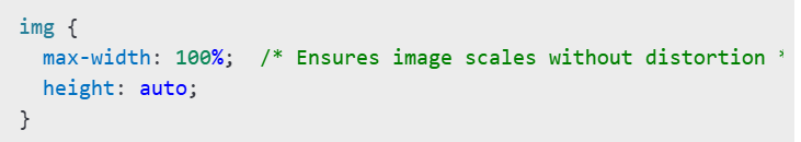
- Flexible Images and Media: Images and videos should scale responsively within their containers. Prevent overflow using CSS.
- CSS Media Queries: Apply different styles based on screen size, orientation, and other device characteristics.

- Flexbox for Layouts: A powerful tool for creating responsive layouts without relying on floats.

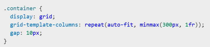
- CSS Grid for Complex Layouts: Easily build two-dimensional responsive layouts.
- Scalable Typography (REM & EM): Use rem or em units for font sizes instead of fixed pixel values to ensure proper scaling.

- Mobile-Optimized Navigation: Simplify complex navigation menus for smaller screens using techniques like hamburger menus or collapsible navigation.

- Thorough Testing: Test your design across various devices and browsers using browser developer tools, the Google Mobile-Friendly Test, responsive design modes in Chrome/Firefox, and online tools like BrowserStack.
Conclusion
Mastering RWD with CSS is crucial for modern web development. By implementing these techniques – fluid grids, flexible media, media queries, Flexbox, CSS Grid, and scalable typography – you can create visually stunning, user-friendly websites that adapt flawlessly to any screen size. Put these techniques into practice today and transform your website's responsiveness! Next steps: Optimize an existing website to see the dramatic improvements firsthand.
The above is the detailed content of How to Master Responsive Web Design with CSS. For more information, please follow other related articles on the PHP Chinese website!

Hot AI Tools

Undress AI Tool
Undress images for free

Undresser.AI Undress
AI-powered app for creating realistic nude photos

AI Clothes Remover
Online AI tool for removing clothes from photos.

Clothoff.io
AI clothes remover

Video Face Swap
Swap faces in any video effortlessly with our completely free AI face swap tool!

Hot Article
Hot Tools

Notepad++7.3.1
Easy-to-use and free code editor

SublimeText3 Chinese version
Chinese version, very easy to use

Zend Studio 13.0.1
Powerful PHP integrated development environment

Dreamweaver CS6
Visual web development tools

SublimeText3 Mac version
God-level code editing software (SublimeText3)
Hot Topics
 1794
1794
 16
1740
56
1591
29
1473
72
267
587
16
1740
56
1591
29
1473
72
267
587

 What is Autoprefixer and how does it work?
Jul 02, 2025 am 01:15 AM
What is Autoprefixer and how does it work?
Jul 02, 2025 am 01:15 AM
Autoprefixer is a tool that automatically adds vendor prefixes to CSS attributes based on the target browser scope. 1. It solves the problem of manually maintaining prefixes with errors; 2. Work through the PostCSS plug-in form, parse CSS, analyze attributes that need to be prefixed, and generate code according to configuration; 3. The usage steps include installing plug-ins, setting browserslist, and enabling them in the build process; 4. Notes include not manually adding prefixes, keeping configuration updates, prefixes not all attributes, and it is recommended to use them with the preprocessor.
 CSS tutorial for creating a sticky header or footer
Jul 02, 2025 am 01:04 AM
CSS tutorial for creating a sticky header or footer
Jul 02, 2025 am 01:04 AM
TocreatestickyheadersandfooterswithCSS,useposition:stickyforheaderswithtopvalueandz-index,ensuringparentcontainersdon’trestrictit.1.Forstickyheaders:setposition:sticky,top:0,z-index,andbackgroundcolor.2.Forstickyfooters,betteruseposition:fixedwithbot
 What is the conic-gradient() function?
Jul 01, 2025 am 01:16 AM
What is the conic-gradient() function?
Jul 01, 2025 am 01:16 AM
Theconic-gradient()functioninCSScreatescirculargradientsthatrotatecolorstopsaroundacentralpoint.1.Itisidealforpiecharts,progressindicators,colorwheels,anddecorativebackgrounds.2.Itworksbydefiningcolorstopsatspecificangles,optionallystartingfromadefin
 CSS tutorial for creating loading spinners and animations
Jul 07, 2025 am 12:07 AM
CSS tutorial for creating loading spinners and animations
Jul 07, 2025 am 12:07 AM
There are three ways to create a CSS loading rotator: 1. Use the basic rotator of borders to achieve simple animation through HTML and CSS; 2. Use a custom rotator of multiple points to achieve the jump effect through different delay times; 3. Add a rotator in the button and switch classes through JavaScript to display the loading status. Each approach emphasizes the importance of design details such as color, size, accessibility and performance optimization to enhance the user experience.
 CSS tutorial focusing on mobile-first design
Jul 02, 2025 am 12:52 AM
CSS tutorial focusing on mobile-first design
Jul 02, 2025 am 12:52 AM
Mobile-firstCSSdesignrequiressettingtheviewportmetatag,usingrelativeunits,stylingfromsmallscreensup,optimizingtypographyandtouchtargets.First,addtocontrolscaling.Second,use%,em,orreminsteadofpixelsforflexiblelayouts.Third,writebasestylesformobile,the
 How to create an intrinsically responsive grid layout?
Jul 02, 2025 am 01:19 AM
How to create an intrinsically responsive grid layout?
Jul 02, 2025 am 01:19 AM
To create an intrinsic responsive grid layout, the core method is to use CSSGrid's repeat(auto-fit,minmax()) mode; 1. Set grid-template-columns:repeat(auto-fit,minmax(200px,1fr)) to let the browser automatically adjust the number of columns and limit the minimum and maximum widths of each column; 2. Use gap to control grid spacing; 3. The container should be set to relative units such as width:100%, and use box-sizing:border-box to avoid width calculation errors and center them with margin:auto; 4. Optionally set the row height and content alignment to improve visual consistency, such as row
 How to center an entire grid within the viewport?
Jul 02, 2025 am 12:53 AM
How to center an entire grid within the viewport?
Jul 02, 2025 am 12:53 AM
To make the entire grid layout centered in the viewport, it can be achieved by the following methods: 1. Use margin:0auto to achieve horizontal centering, and the container needs to be set to set the fixed width, which is suitable for fixed layout; 2. Use Flexbox to set the justify-content and align-items properties in the outer container, and combine min-height:100vh to achieve vertical and horizontal centering, which is suitable for full-screen display scenarios; 3. Use CSSGrid's place-items property to quickly center on the parent container, which is simple and has good support from modern browsers, and at the same time, it is necessary to ensure that the parent container has sufficient height. Each method has applicable scenarios and restrictions, just choose the appropriate solution according to actual needs.
 What is feature detection in CSS using @supports?
Jul 02, 2025 am 01:14 AM
What is feature detection in CSS using @supports?
Jul 02, 2025 am 01:14 AM
FeaturedetectioninCSSusing@supportschecksifabrowsersupportsaspecificfeaturebeforeapplyingrelatedstyles.1.ItusesconditionalCSSblocksbasedonproperty-valuepairs,suchas@supports(display:grid).2.Thismethodensuresfuturecompatibilityandavoidsrelianceonunrel
