


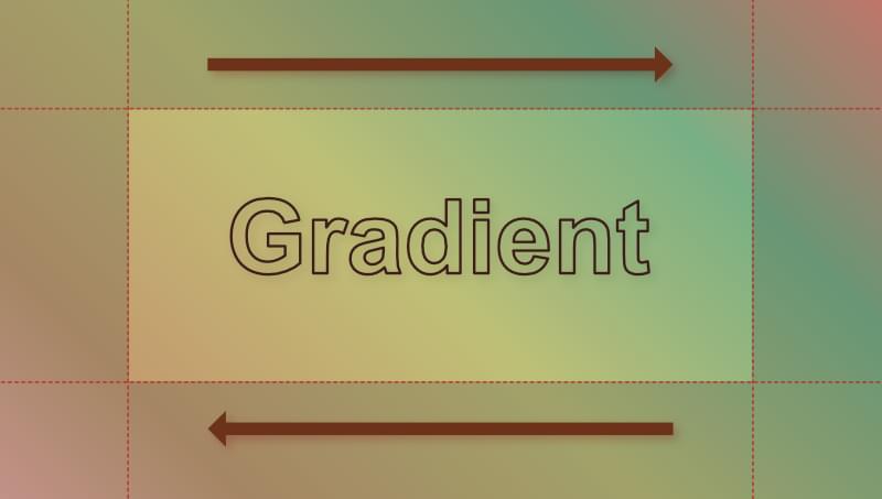
In this quick tip, we’ll show how easy it is to animate a background gradient with CSS.
In a recent article, we showed how to set a background gradient on text. The CodePen demo below shows the result.
See the Pen
Text with left to right gradient by SitePoint (@SitePoint)
on CodePen.
Make sure to read through that article if you’re not sure how we got to this result, as we’ll build on this example below.
For the sake of this demo, let’s add in some extra colors to our gradient background:
<span>h1 {
</span>  <span>background-image: linear-gradient(
</span>    <span>45deg,
</span>    <span>#ffb3ba,
</span>    <span>#c49c6e,
</span>    <span>#bfbf76,
</span>    <span>#77b084,
</span>    <span>#ff7e74,
</span>    <span>#3b82f6,
</span>    <span>#c084fc,
</span>    <span>#db2777
</span>   <span>);
</span><span>}
</span>
If we turn off background-clip: text and text-color: transparent for a moment, we get a better sense of how our gradient fills the text’s content box.
See the Pen
Text with animated background gradient: 1 by SitePoint (@SitePoint)
on CodePen.
Let’s now go through the steps of animating our background gradient.
Step 1: Adjusting the Background Size
To animate our gradient background, we need to make it bigger than the text’s content box so we can’t see all of it at once. We can do that with the handy background-size property. (You can read all about background-size here.)
I’m going to set the width of our background gradient to three times the width of our heading element:
<span>h1 {
</span>  <span>background-size: 300% 100%;
</span><span>}
</span>
Now, only a third of the gradient background will be visible at any one time, as seen below.
See the Pen
Text with animated background gradient: step 2 by SitePoint (@SitePoint)
on CodePen.
Step 2: Setting an Animation
Next, we’ll set up an animation that will move the background around so that we’ll see different parts of it over time.
We can set up a simple animation rule like so:
<span>h1 {
</span>  <span>animation: gradientAnimation 8s linear infinite;
</span><span>}
</span>
That will move the background back and forth once every 16 seconds.
Next, we’ll set up an @keyframes statement:
<span><span>@keyframes gradientAnimation</span> {
</span>  <span>0% {
</span>    <span>background-position: 0;
</span>  <span>}
</span>  <span>to {
</span>    <span>background-position: 100%;
</span>  <span>}
</span><span>}
</span>
This simple @keyframes statement will move our background from the top left to the bottom right every eight seconds.
In the Pen below, we’ve once again disabled background-clip: text and color: transparent so we can see what’s happening in the background.
See the Pen
Text with animated background gradient: step 3 by SitePoint (@SitePoint)
on CodePen.
Once we re-enable background-clip: text and color: transparent, we see the finished product.
See the Pen
Text with animated background gradient: step 4 (final) by SitePoint (@SitePoint)
on CodePen.
Pretty cool!
Animating a Background Image
In our article on adding gradient effects and patterns to text, we also used a floral background image. (See the Pen for that here.)
Let’s have a go at animating that background too. We’ll do it slightly differently, as we don’t want to distort the background image.
Let’s remove background-size: contain from the original demo and not set a background size at all. That leaves us with this:
<span>h1 {
</span>  <span>background-image: linear-gradient(
</span>    <span>45deg,
</span>    <span>#ffb3ba,
</span>    <span>#c49c6e,
</span>    <span>#bfbf76,
</span>    <span>#77b084,
</span>    <span>#ff7e74,
</span>    <span>#3b82f6,
</span>    <span>#c084fc,
</span>    <span>#db2777
</span>   <span>);
</span><span>}
</span>
The result is shown in the CodePen demo below.
See the Pen
Animating a background image on text by SitePoint (@SitePoint)
on CodePen.
Try turning off background-clip: text and text-color: transparent for a moment if you want to see what’s happening in the background.
Our background image is repeating by default, which doesn’t look too bad for this particular image. (Just out of interest, try adding background-repeat: no-repeat to see what what happens without a repeating background.) In other situations, where the background image doesn’t tile so well, you might want to prevent the image repeating and then use background-size to make the image larger, like we did with the gradient background above. For example:
<span>h1 {
</span>  <span>background-size: 300% 100%;
</span><span>}
</span>
Here’s the effect of doing that on our floral demo.
See the Pen
Animating a background image on text: step1a (background size experiment) by SitePoint (@SitePoint)
on CodePen.
Conclusion
We could do much more spectacular animations that this, but the aim was to keep it simple here. You can dig deeper into CSS keyframes and animations in How to Get Started with CSS Animation. You can also play around with the timing of the animation, angle of the gradient and so on.
As mentioned in the previous article, have fun with this but don’t go overboard, as too much of this kind of animation can become annoying. A subtle animated background on a heading might just add that touch of interest or intrigue you need to keep your audience engaged.
The above is the detailed content of Quick Tip: How to Animate Text Gradients and Patterns in CSS. For more information, please follow other related articles on the PHP Chinese website!

Hot AI Tools

Undress AI Tool
Undress images for free

Undresser.AI Undress
AI-powered app for creating realistic nude photos

AI Clothes Remover
Online AI tool for removing clothes from photos.

Clothoff.io
AI clothes remover

Video Face Swap
Swap faces in any video effortlessly with our completely free AI face swap tool!

Hot Article
Hot Tools

Notepad++7.3.1
Easy-to-use and free code editor

SublimeText3 Chinese version
Chinese version, very easy to use

Zend Studio 13.0.1
Powerful PHP integrated development environment

Dreamweaver CS6
Visual web development tools

SublimeText3 Mac version
God-level code editing software (SublimeText3)
Hot Topics


 What is 'render-blocking CSS'?
Jun 24, 2025 am 12:42 AM
What is 'render-blocking CSS'?
Jun 24, 2025 am 12:42 AM
CSS blocks page rendering because browsers view inline and external CSS as key resources by default, especially with imported stylesheets, header large amounts of inline CSS, and unoptimized media query styles. 1. Extract critical CSS and embed it into HTML; 2. Delay loading non-critical CSS through JavaScript; 3. Use media attributes to optimize loading such as print styles; 4. Compress and merge CSS to reduce requests. It is recommended to use tools to extract key CSS, combine rel="preload" asynchronous loading, and use media delayed loading reasonably to avoid excessive splitting and complex script control.
 External vs. Internal CSS: What's the Best Approach?
Jun 20, 2025 am 12:45 AM
External vs. Internal CSS: What's the Best Approach?
Jun 20, 2025 am 12:45 AM
ThebestapproachforCSSdependsontheproject'sspecificneeds.Forlargerprojects,externalCSSisbetterduetomaintainabilityandreusability;forsmallerprojectsorsingle-pageapplications,internalCSSmightbemoresuitable.It'scrucialtobalanceprojectsize,performanceneed
 What is Autoprefixer and how does it work?
Jul 02, 2025 am 01:15 AM
What is Autoprefixer and how does it work?
Jul 02, 2025 am 01:15 AM
Autoprefixer is a tool that automatically adds vendor prefixes to CSS attributes based on the target browser scope. 1. It solves the problem of manually maintaining prefixes with errors; 2. Work through the PostCSS plug-in form, parse CSS, analyze attributes that need to be prefixed, and generate code according to configuration; 3. The usage steps include installing plug-ins, setting browserslist, and enabling them in the build process; 4. Notes include not manually adding prefixes, keeping configuration updates, prefixes not all attributes, and it is recommended to use them with the preprocessor.
 CSS Case Sensitivity: Understanding What Matters
Jun 20, 2025 am 12:09 AM
CSS Case Sensitivity: Understanding What Matters
Jun 20, 2025 am 12:09 AM
CSSismostlycase-insensitive,butURLsandfontfamilynamesarecase-sensitive.1)Propertiesandvalueslikecolor:red;arenotcase-sensitive.2)URLsmustmatchtheserver'scase,e.g.,/images/Logo.png.3)Fontfamilynameslike'OpenSans'mustbeexact.
 What is the conic-gradient() function?
Jul 01, 2025 am 01:16 AM
What is the conic-gradient() function?
Jul 01, 2025 am 01:16 AM
Theconic-gradient()functioninCSScreatescirculargradientsthatrotatecolorstopsaroundacentralpoint.1.Itisidealforpiecharts,progressindicators,colorwheels,anddecorativebackgrounds.2.Itworksbydefiningcolorstopsatspecificangles,optionallystartingfromadefin
 CSS tutorial for creating a sticky header or footer
Jul 02, 2025 am 01:04 AM
CSS tutorial for creating a sticky header or footer
Jul 02, 2025 am 01:04 AM
TocreatestickyheadersandfooterswithCSS,useposition:stickyforheaderswithtopvalueandz-index,ensuringparentcontainersdon’trestrictit.1.Forstickyheaders:setposition:sticky,top:0,z-index,andbackgroundcolor.2.Forstickyfooters,betteruseposition:fixedwithbot
 What is the scope of a CSS Custom Property?
Jun 25, 2025 am 12:16 AM
What is the scope of a CSS Custom Property?
Jun 25, 2025 am 12:16 AM
The scope of CSS custom properties depends on the context of their declaration, global variables are usually defined in :root, while local variables are defined within a specific selector for componentization and isolation of styles. For example, variables defined in the .card class are only available for elements that match the class and their children. Best practices include: 1. Use: root to define global variables such as topic color; 2. Define local variables inside the component to implement encapsulation; 3. Avoid repeatedly declaring the same variable; 4. Pay attention to the coverage problems that may be caused by selector specificity. Additionally, CSS variables are case sensitive and should be defined before use to avoid errors. If the variable is undefined or the reference fails, the fallback value or default value initial will be used. Debug can be done through the browser developer
 Unlock the Potential of CSS Animations: A Deep Dive
Jun 20, 2025 am 12:14 AM
Unlock the Potential of CSS Animations: A Deep Dive
Jun 20, 2025 am 12:14 AM
CSSanimationsenhancewebpagesbyimprovinguserexperienceandsitefunctionality.1)Usetransitionsforsmoothstylechanges,asinthebuttoncolorexample.2)Employkeyframesfordetailedanimations,likethebouncingball.3)Ensureperformancebykeepinganimationssimpleandusingt
