


This article explores techniques for mastering the spacing between columns in responsive grid layouts, using a responsive image gallery as a practical example.
For further insights into responsive layouts, view our screencast: Creating Multiple Column Layouts in Flexbox.
Key Takeaways:
- Custom responsive layouts are achievable by precisely controlling inter-column spacing, as demonstrated with the responsive image gallery.
- The
display: inline-blockmethod creates responsive image galleries; setting the parent's font size to zero removes default inline-block spacing. - Flexbox efficiently solves common layout issues, creating equal-height columns across all screen sizes, simplifying inter-column spacing control in responsive image grids.
- Media queries and CSS Grid layouts enable responsive image grids, applying different CSS rules based on device characteristics (screen size).
Building a Responsive Layout:
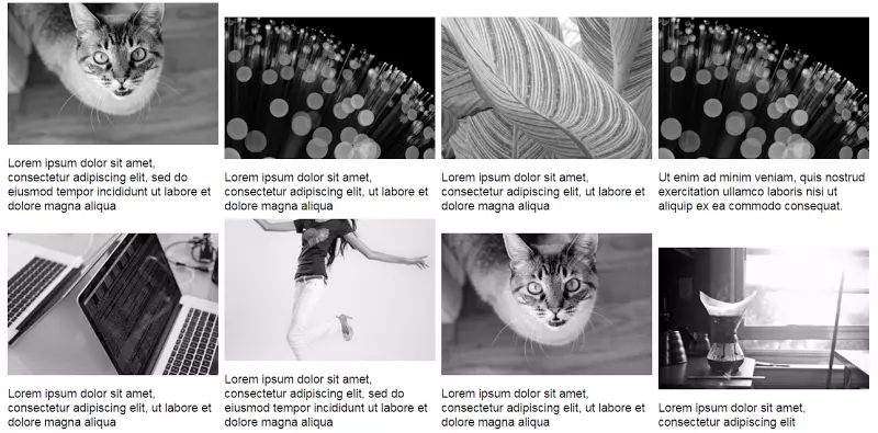
On larger screens, the gallery resembles this:

On smaller screens:

The simple markup:
<div>
  <a href="http://m.miracleart.cn/link/14d2bc475177e1dde633b4ca1972d53c">
    <img src="/static/imghw/default1.png"  data-src="https://img.php.cn/"  class="lazy" alt="Using Modern CSS to Build a Responsive Image Grid " />
  </a>
  <!-- ...more images... -->
</div>
Several layout methods achieve this. Before exploring two, let's reiterate the requirements:
- Two-column layout on medium and smaller screens.
- 8px inter-column spacing.
Using inline-block:
The display: inline-block method builds the gallery. Consider this CSS:
div {
  font-size: 0;
}

a {
  font-size: 16px;
  display: inline-block;
  margin-bottom: 8px;
  width: calc(50% - 4px);
  margin-right: 8px;
}

a:nth-of-type(2n) {
  margin-right: 0;
}

@media screen and (min-width: 50em) {
  a {
    width: calc(25% - 6px);
  }

  a:nth-of-type(2n) {
    margin-right: 8px;
  }

  a:nth-of-type(4n) {
    margin-right: 0;
  }
}
Explanation:
Default inline-block spacing is overridden by setting the parent's font size to zero. Child element font sizes may need resetting (not here).
Small screens have a two-column layout with 8px spacing. Column width calculation:
- Total inter-column space per row: 1 * 8px = 8px (8px, not 16px, because the right margin is removed from every second column).
- Column width:
calc(50% - 4px)(4px = 8px / 2).

Large screens have a four-column layout with 8px spacing. Column width calculation:
- Total inter-column space per row: 3 * 8px = 24px (24px, not 32px, because the right margin is removed from every fourth column).
- Column width:
calc(25% - 6px)(6px = 24px / 4).

See the CodePen demo for the inline-block method.
Using Flexbox:
The inline-block solution has drawbacks. Adding captions demonstrates one:
Updated markup:
<div>
  <a href="http://m.miracleart.cn/link/14d2bc475177e1dde633b4ca1972d53c">
    <img src="/static/imghw/default1.png"  data-src="https://img.php.cn/"  class="lazy" alt="Using Modern CSS to Build a Responsive Image Grid " />
  </a>
  <!-- ...more images... -->
</div>
Large screen gallery with captions:
Unequal heights are resolved with Flexbox. Update the parent element's CSS:
div {
  font-size: 0;
}

a {
  font-size: 16px;
  display: inline-block;
  margin-bottom: 8px;
  width: calc(50% - 4px);
  margin-right: 8px;
}

a:nth-of-type(2n) {
  margin-right: 0;
}

@media screen and (min-width: 50em) {
  a {
    width: calc(25% - 6px);
  }

  a:nth-of-type(2n) {
    margin-right: 8px;
  }

  a:nth-of-type(4n) {
    margin-right: 0;
  }
}
The result is equal-height columns across all screens. Large screen example:

See the CodePen demo using Flexbox with improved captions.
Flexbox's justify-content property doesn't directly create this layout. space-between and space-around result in awkward distribution on the last row. CSS:
<div>
  <a href="http://m.miracleart.cn/link/14d2bc475177e1dde633b4ca1972d53c">
    <img src="/static/imghw/default1.png"  data-src="https://img.php.cn/"  class="lazy" alt="Using Modern CSS to Build a Responsive Image Grid " />
    <figcaption>Some text here</figcaption>
  </a>
  <!-- ...more images... -->
</div>
No margin-right is needed; justify-content handles item distribution.
See the CodePen demo using the justify-content property.
Conclusion:
This post details techniques for controlling inter-column spacing in responsive image grids. While inline-block suffices, Flexbox is easier and more convenient, especially with calc().
Learn more about Flexbox layouts in our screencast: Creating Multiple Column Layouts in Flexbox.
(FAQs section omitted for brevity, as it's a repetition of common responsive design questions.)
The above is the detailed content of Using Modern CSS to Build a Responsive Image Grid. For more information, please follow other related articles on the PHP Chinese website!

Hot AI Tools

Undress AI Tool
Undress images for free

Undresser.AI Undress
AI-powered app for creating realistic nude photos

AI Clothes Remover
Online AI tool for removing clothes from photos.

Clothoff.io
AI clothes remover

Video Face Swap
Swap faces in any video effortlessly with our completely free AI face swap tool!

Hot Article
Hot Tools

Notepad++7.3.1
Easy-to-use and free code editor

SublimeText3 Chinese version
Chinese version, very easy to use

Zend Studio 13.0.1
Powerful PHP integrated development environment

Dreamweaver CS6
Visual web development tools

SublimeText3 Mac version
God-level code editing software (SublimeText3)
Hot Topics


 What is 'render-blocking CSS'?
Jun 24, 2025 am 12:42 AM
What is 'render-blocking CSS'?
Jun 24, 2025 am 12:42 AM
CSS blocks page rendering because browsers view inline and external CSS as key resources by default, especially with imported stylesheets, header large amounts of inline CSS, and unoptimized media query styles. 1. Extract critical CSS and embed it into HTML; 2. Delay loading non-critical CSS through JavaScript; 3. Use media attributes to optimize loading such as print styles; 4. Compress and merge CSS to reduce requests. It is recommended to use tools to extract key CSS, combine rel="preload" asynchronous loading, and use media delayed loading reasonably to avoid excessive splitting and complex script control.
 External vs. Internal CSS: What's the Best Approach?
Jun 20, 2025 am 12:45 AM
External vs. Internal CSS: What's the Best Approach?
Jun 20, 2025 am 12:45 AM
ThebestapproachforCSSdependsontheproject'sspecificneeds.Forlargerprojects,externalCSSisbetterduetomaintainabilityandreusability;forsmallerprojectsorsingle-pageapplications,internalCSSmightbemoresuitable.It'scrucialtobalanceprojectsize,performanceneed
 What is Autoprefixer and how does it work?
Jul 02, 2025 am 01:15 AM
What is Autoprefixer and how does it work?
Jul 02, 2025 am 01:15 AM
Autoprefixer is a tool that automatically adds vendor prefixes to CSS attributes based on the target browser scope. 1. It solves the problem of manually maintaining prefixes with errors; 2. Work through the PostCSS plug-in form, parse CSS, analyze attributes that need to be prefixed, and generate code according to configuration; 3. The usage steps include installing plug-ins, setting browserslist, and enabling them in the build process; 4. Notes include not manually adding prefixes, keeping configuration updates, prefixes not all attributes, and it is recommended to use them with the preprocessor.
 CSS Case Sensitivity: Understanding What Matters
Jun 20, 2025 am 12:09 AM
CSS Case Sensitivity: Understanding What Matters
Jun 20, 2025 am 12:09 AM
CSSismostlycase-insensitive,butURLsandfontfamilynamesarecase-sensitive.1)Propertiesandvalueslikecolor:red;arenotcase-sensitive.2)URLsmustmatchtheserver'scase,e.g.,/images/Logo.png.3)Fontfamilynameslike'OpenSans'mustbeexact.
 What is the conic-gradient() function?
Jul 01, 2025 am 01:16 AM
What is the conic-gradient() function?
Jul 01, 2025 am 01:16 AM
Theconic-gradient()functioninCSScreatescirculargradientsthatrotatecolorstopsaroundacentralpoint.1.Itisidealforpiecharts,progressindicators,colorwheels,anddecorativebackgrounds.2.Itworksbydefiningcolorstopsatspecificangles,optionallystartingfromadefin
 CSS tutorial for creating a sticky header or footer
Jul 02, 2025 am 01:04 AM
CSS tutorial for creating a sticky header or footer
Jul 02, 2025 am 01:04 AM
TocreatestickyheadersandfooterswithCSS,useposition:stickyforheaderswithtopvalueandz-index,ensuringparentcontainersdon’trestrictit.1.Forstickyheaders:setposition:sticky,top:0,z-index,andbackgroundcolor.2.Forstickyfooters,betteruseposition:fixedwithbot
 What is the scope of a CSS Custom Property?
Jun 25, 2025 am 12:16 AM
What is the scope of a CSS Custom Property?
Jun 25, 2025 am 12:16 AM
The scope of CSS custom properties depends on the context of their declaration, global variables are usually defined in :root, while local variables are defined within a specific selector for componentization and isolation of styles. For example, variables defined in the .card class are only available for elements that match the class and their children. Best practices include: 1. Use: root to define global variables such as topic color; 2. Define local variables inside the component to implement encapsulation; 3. Avoid repeatedly declaring the same variable; 4. Pay attention to the coverage problems that may be caused by selector specificity. Additionally, CSS variables are case sensitive and should be defined before use to avoid errors. If the variable is undefined or the reference fails, the fallback value or default value initial will be used. Debug can be done through the browser developer
 Unlock the Potential of CSS Animations: A Deep Dive
Jun 20, 2025 am 12:14 AM
Unlock the Potential of CSS Animations: A Deep Dive
Jun 20, 2025 am 12:14 AM
CSSanimationsenhancewebpagesbyimprovinguserexperienceandsitefunctionality.1)Usetransitionsforsmoothstylechanges,asinthebuttoncolorexample.2)Employkeyframesfordetailedanimations,likethebouncingball.3)Ensureperformancebykeepinganimationssimpleandusingt
