Find, label and highlight a certain data point in Excel scatter graph
Apr 06, 2025 am 09:48 AMThis tutorial demonstrates how to identify, highlight, and label specific data points within an Excel scatter chart, defining their precise x and y-axis positions. This is particularly useful when dealing with numerous data points, making it difficult to locate specific ones.
Last week's tutorial covered creating scatter plots in Excel. This week focuses on manipulating individual data points. While third-party add-ins exist, a straightforward Excel technique achieves this. The process involves several steps:
-
Source Data: Assuming you have related numerical data (e.g., advertising costs and sales) and a corresponding scatter plot showing their correlation:

-
Extract x and y Values: To highlight a specific data point (e.g., for a particular month), extract its x (Advertising) and y (Items Sold) values.
a. Enter the point's label (e.g., "May") in a separate cell (e.g., E2). Ensure exact label matching from your source data. b. Use
=VLOOKUP($E$2,$A$2:$C$13,2,FALSE)in cell F2 to get the "Items Sold" value. c. Use=VLOOKUP($E$2,$A$2:$C$13,3,FALSE)in cell G2 to get the "Advertising" cost.This results in a table like this:

-
Add a New Data Series: Add a new data series to your scatter chart to represent the target point:
a. Right-click the chart's axis and select "Select Data…".
 b. Click "Add".
 c. In "Edit Series," name the series (e.g., "Target Month"), select cell F2 for "Series X value" (Advertising), and G2 for "Series Y value" (Items Sold).
d. Click "OK".
c. In "Edit Series," name the series (e.g., "Target Month"), select cell F2 for "Series X value" (Advertising), and G2 for "Series Y value" (Items Sold).
d. Click "OK".This adds an orange data point representing your selected data.

-
Customize the Target Data Point: Enhance the highlighted point's visibility:
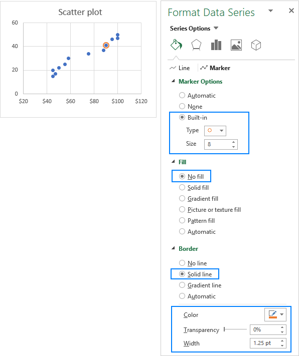
a. Change Appearance: Right-click the point, select "Format Data Series…", adjust the marker's fill and border colors under "Fill & Line" > "Marker". Consider using different marker styles for better visual distinction.


b. Add Data Labels: Click the highlighted point, use the "Chart Elements" button to add data labels, customizing their position and content (x, y values, or cell values) via "Format Data Labels…".


c. Show Axis Position: Add error bars (using "Chart Elements" > "Error Bars" > "Percentage") set to 100% in both directions ("Format Error Bars…"). This creates lines extending to the axes, clearly marking the point's coordinates. Customize error bar appearance as needed.


-
Highlighting Average/Benchmark Points: This same technique applies to highlighting average, minimum, or maximum points. Calculate the average x and y values using the
AVERAGEfunction and add them as a new data series.
This method dynamically updates the highlighted point whenever the "Target Month" cell (E2) is changed. A sample workbook is available for further practice.
The above is the detailed content of Find, label and highlight a certain data point in Excel scatter graph. For more information, please follow other related articles on the PHP Chinese website!

Hot AI Tools

Undress AI Tool
Undress images for free

Undresser.AI Undress
AI-powered app for creating realistic nude photos

AI Clothes Remover
Online AI tool for removing clothes from photos.

Clothoff.io
AI clothes remover

Video Face Swap
Swap faces in any video effortlessly with our completely free AI face swap tool!

Hot Article

Hot Tools

Notepad++7.3.1
Easy-to-use and free code editor

SublimeText3 Chinese version
Chinese version, very easy to use

Zend Studio 13.0.1
Powerful PHP integrated development environment

Dreamweaver CS6
Visual web development tools

SublimeText3 Mac version
God-level code editing software (SublimeText3)


 b. Click "Add".
 c. In "Edit Series," name the series (e.g., "Target Month"), select cell F2 for "Series X value" (Advertising), and G2 for "Series Y value" (Items Sold).
d. Click "OK".


