

How to implement Bootstrap unordered list?
Apr 07, 2025 am 10:54 AM
Bootstrap unordered lists do not use new tags, but use CSS classes to beautify the original
and <li> tags. The main steps include: Use the .list-unstyled class to remove the default list style. Use the .list-inline class to arrange list items into a row. Control list layout in conjunction with the grid system. Customize styles with caution and prioritize the use of classes provided by Bootstrap.

Bootstrap unordered list? This question is awesome! To put it bluntly, Bootstrap has not invented any new HTML tags. It just uses CSS to beautify <ul></ul> and <li> tags you are already familiar with. Therefore, the core of implementing the unordered list of Bootstrap style is to cleverly use the CSS classes provided by Bootstrap.
You may think this is very simple, isn’t it just adding a class? But there are actually many details here, which can make the code you write more elegantly, more in line with the style of Bootstrap, and more importantly, it is easier to maintain and expand.
Let’s review the basics first. The <ul></ul> tag in HTML defines an unordered list, and the <li> tag defines a list item. Bootstrap uses a series of classes to control the style of the list. For example .list-unstyled can directly remove the default list style, including bullets. This is very useful for lists that require custom styles.
Let's take a look at a simple example:
<code class="html"><ul class="list-unstyled"> <li>這是第一個(gè)列表項(xiàng)</li> <li>這是第二個(gè)列表項(xiàng)</li> <li>這是第三個(gè)列表項(xiàng)</li> </ul></code>
After this code is run, you will see a list without bullets. Isn't it very simple? But don't worry, this is just an introduction.
Bootstrap also provides other classes, such as .list-inline , which can line up list items. This is useful when creating horizontal navigation menus or labels.
<code class="html"><ul class="list-inline"> <li class="list-inline-item">選項(xiàng)一</li> <li class="list-inline-item">選項(xiàng)二</li> <li class="list-inline-item">選項(xiàng)三</li> </ul></code>
Pay attention to .list-inline-item class here, which makes additional style adjustments to list items to make them more suitable for horizontal arrangement. Ignore this class, the effect of list-inline may not be what you want.
To go deeper, you can combine Bootstrap's grid system to control the layout of the list. Imagine that you want to display a list in a column, and this list needs a responsive layout. At this time, you can place <ul></ul> in a grid column and use the responsive characteristics of Bootstrap to control the display effect of the list under different screen sizes. This requires you to have some understanding of Bootstrap's grid system.
Of course, you can also completely customize the style of the list by overwriting the default style of Bootstrap. But I don't recommend you to do this unless you really know what you are doing. Because this will increase the complexity of the code, and your custom style may be invalid when upgrading Bootstrap in the future. Unless necessary, try to use the classes provided by Bootstrap to control styles, which is the best practice.
Finally, remember that Bootstrap is just a tool that can help you quickly build pages, but the truly exquisite design and code depends on your in-depth understanding of HTML, CSS and Bootstrap. Don’t be superstitious about tools, you must understand the principles behind them. This way you can write more elegant, robust and easier to maintain code.
The above is the detailed content of How to implement Bootstrap unordered list?. For more information, please follow other related articles on the PHP Chinese website!

Hot AI Tools

Undress AI Tool
Undress images for free

Undresser.AI Undress
AI-powered app for creating realistic nude photos

AI Clothes Remover
Online AI tool for removing clothes from photos.

Clothoff.io
AI clothes remover

Video Face Swap
Swap faces in any video effortlessly with our completely free AI face swap tool!

Hot Article
Hot Tools

Notepad++7.3.1
Easy-to-use and free code editor

SublimeText3 Chinese version
Chinese version, very easy to use

Zend Studio 13.0.1
Powerful PHP integrated development environment

Dreamweaver CS6
Visual web development tools

SublimeText3 Mac version
God-level code editing software (SublimeText3)
Hot Topics
 1794
1794
 16
1739
56
1590
29
1467
72
267
587
16
1739
56
1590
29
1467
72
267
587

 How to use PHP to develop a Q&A community platform Detailed explanation of PHP interactive community monetization model
Jul 23, 2025 pm 07:21 PM
How to use PHP to develop a Q&A community platform Detailed explanation of PHP interactive community monetization model
Jul 23, 2025 pm 07:21 PM
1. The first choice for the Laravel MySQL Vue/React combination in the PHP development question and answer community is the first choice for Laravel MySQL Vue/React combination, due to its maturity in the ecosystem and high development efficiency; 2. High performance requires dependence on cache (Redis), database optimization, CDN and asynchronous queues; 3. Security must be done with input filtering, CSRF protection, HTTPS, password encryption and permission control; 4. Money optional advertising, member subscription, rewards, commissions, knowledge payment and other models, the core is to match community tone and user needs.
 Describe the `word-break` and `word-wrap` properties
Jul 16, 2025 am 02:08 AM
Describe the `word-break` and `word-wrap` properties
Jul 16, 2025 am 02:08 AM
Word-break and overflow-wrap (formerly word-wrap) do differently when dealing with long words or unbreakable content. 1. Word-break controls how to break lines of words in block elements, break-all forces long words to break, keep-all avoids breaking, suitable for Chinese, Japanese and Korean texts. 2. Overflow-wrap disconnects long words when necessary to prevent overflow, break-word makes the context more intelligent. 3. In usage scenarios, use word-break:break-all for code, and use overflow-wrap:break-word for user comments. 4. Pay attention to differences in browser compatibility and different mobile behaviors
 How does browser default stylesheet affect rendering?
Jul 19, 2025 am 02:08 AM
How does browser default stylesheet affect rendering?
Jul 19, 2025 am 02:08 AM
Browser default styles ensure basic readability by automatically applying margins, fills, fonts, and form element styles, but can cause inconsistent cross-browser layouts. 1. The default margin and fill change the layout flow, such as the spacing of titles, paragraphs and lists; 2. The default font settings affect readability, such as 16px font size and TimesNewRoman font; 3. The form elements are very different in different browsers, so the appearance needs to be reset; 4. Some tags such as strong and em have default emphasis styles and need to be explicitly overwritten. Workarounds include using Normalize.css, reset styles, or globally clear margins and fills, while customizing fonts and form styles for consistency.
 How to style the first letter or first line of a paragraph?
Jul 19, 2025 am 02:58 AM
How to style the first letter or first line of a paragraph?
Jul 19, 2025 am 02:58 AM
To beautify the beginning of a paragraph to enhance visual appeal, a common practice is to use pseudo-elements of CSS or manually style the document. In web development, p::first-letter can be used to set the first letter style, such as enlarging, bolding, and discoloring, but it should be noted that it is only suitable for block-level elements; if you want to highlight the entire first line, use p::first-line to add styles; in document software such as Word, you can manually adjust the first letter format or create style templates, and InDesign has a built-in "first-sinking" function suitable for publishing and design; when applying, you need to pay attention to details, such as avoiding complex styles affecting reading and ensuring compatibility and format consistency.
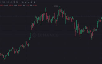 What is the K-line? How to view the Bitcoin K-line chart? Analysis of common K-line patterns
Jul 22, 2025 pm 11:15 PM
What is the K-line? How to view the Bitcoin K-line chart? Analysis of common K-line patterns
Jul 22, 2025 pm 11:15 PM
What is the essence of the directory K-line chart? The core component of the K-line is the time period and the uniqueness of the Bitcoin market: The advantages of the K-line chart compared to the ordinary price curve How to interpret a single K-line? Typical forms and practical signal analysis. Two forms: Large entity, short shadow K-line meaning (strong entry or kinetic energy exhaustion) long shadow, and small entity K-line meaning (trend turning point or market hesitation) appear one after another (the probability of changing the market has increased significantly) Where to view the Bitcoin K-line chart? How many minutes should I look at the K-line? Select the right time period to grasp the trend direction Frequently asked questions about Bitcoin K-line chart Q&A conclusion: Master the basics of K-lines and move towards the advanced technology analysis How to quickly get started with the Bitcoin K-line? K-line chart is a tool to visualize price fluctuations and is widely used in stocks, gold,
 Describe the CSS `tab-size` property
Jul 18, 2025 am 03:12 AM
Describe the CSS `tab-size` property
Jul 18, 2025 am 03:12 AM
The tab-size attribute is used to control the number of spaces displayed by tab characters in HTML. The default is 8. The common usage is to adjust the indentation of the code block. 1. Basic usage: Set pre{tab-size:4;} to make the tab appear as 4 space widths, supporting numbers or inherit values. 2. Usage scenario: When displaying code in the structure, adjust the tab indent to make the layout more compact and beautiful, such as setting precode{tab-size:2;}. 3. Notes: Mainstream browsers support but IE is incompatible; it only affects tab display and does not affect spaces; child elements need to be set separately, otherwise the parent settings will not be inherited. The rational use of this attribute can improve the text display effect, especially for code document typesetting.
 Describe the CSS `counter-reset` and `counter-increment` properties
Jul 18, 2025 am 04:00 AM
Describe the CSS `counter-reset` and `counter-increment` properties
Jul 18, 2025 am 04:00 AM
CSS' counter-reset and counter-increment are used to automatically number HTML elements. 1. Use counter-reset to initialize or reset the counter, for example, section{counter-reset:sub-section;} to create a counter named sub-section; 2. Increment the counter through counter-increment, such as h3{counter-increment:sub-section;} to increment each h3 title number; 3. Use content attribute to combine pseudo-elements to display the counter, such as h3::before{content:
 Describe the structure of a CSS rule set
Jul 20, 2025 am 02:49 AM
Describe the structure of a CSS rule set
Jul 20, 2025 am 02:49 AM
The CSS rule set consists of selectors and declaration blocks to define the style of HTML elements. 1. The selector specifies the target element, such as a tag, class, or ID; 2. Declare the block to contain attributes and values to control the appearance of the element. For example: p{color:blue;font-size:16px;} means selecting the paragraph and setting the text color and font size. Master these two parts to write effective CSS styles.
