


resize is a known css property. resize is a new attribute in CSS3 that is used to specify whether an element is resized by the user; the resize attribute allows the user to freely scale the size of the element by dragging.
This method is suitable for all brands of computers.
Related recommendations: "CSS3 Video Tutorial"
css resize attribute
The resize attribute can specify whether an element is resized by the user.
Resize is a new attribute in CSS3, which allows users to freely scale the size of elements by dragging to enhance the user experience. In the past, this could only be achieved by writing a large number of scripts in Javascript, which was time-consuming, labor-intensive and inefficient.
The resize attribute can be used to resize an element according to user needs and in which direction. The resize attribute can take 4 values.
Syntax:
????Element{
????????Resize?:?none|both|vertical|horizontal;
????}
Let’s look at each attribute...
1) resize : none
The none value will not be applied to the resize attribute when the user does not want to resize the element . Also the default value.
Syntax:
????Element{
????????resize:none;
????}
Example:
<!DOCTYPE html>

<html>

<head>
????<style>
????????p?{
????????????border:?3px?solid;
????????????padding:?15px;
????????????width:?300px;
????????????resize:?none;
????????}
????</style>
</head>

<body>
????<h1>The?resize?Property</h1>
????<p>
????????<p>None?value?doesn’t?allow?resizing?of?this?p?element.</p>
????</p>
</body>

</html>
Output

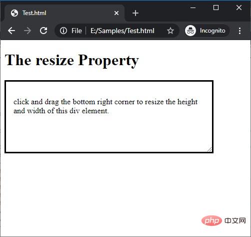
resizable on both sides of width and height. #resize attribute.
Syntax:????Element{
????????resize:both;
????}
<!DOCTYPE html>

<html>

<head>
????<style>
????????p?{
????????????border:?3px?solid;
????????????padding:?15px;
????????????width:?300px;
????????????resize:?both;
????????????overflow:?auto;
????????}
????</style>
</head>

<body>
????<h1>The?resize?Property</h1>
????<p>
????????<p>click?and?drag?the?bottom?right?corner?to?resize?the?height?and?width?of?this?p?element.</p>
????</p>
</body>

</html>
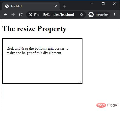
3) resize : vertical
When the user wants to adjust the height of the element as needed, apply the vertical value to the
resize attribute.
Syntax:????Element{
????????resize:vertical;
????}
<!DOCTYPE html>

<html>

<head>
????<style>
????????p?{
????????????border:?3px?solid;
????????????padding:?15px;
????????????width:?300px;
????????????resize:?vertical;
????????????overflow:?auto;
????????}
????</style>
</head>

<body>
????<h1>The?resize?Property</h1>
????<p>
????????<p>click?and?drag?the?bottom?right?corner?to?resize?the?height?of?this?p?element.</p>
????</p>
</body>

</html>
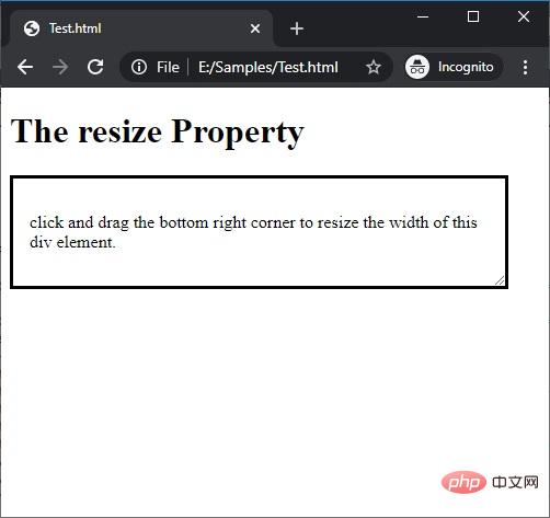
4) resize : horizontal
Apply the horizontal value to the
resize attributewhen the user wants to adjust the width size of an element as needed.
Syntax:????Element{
????????resize:horizontal;
????}
<!DOCTYPE html>

<html>

<head>
????<style>
????????p?{
????????????border:?3px?solid;
????????????padding:?15px;
????????????width:?300px;
????????????resize:?horizontal;
????????????overflow:?auto;
????????}
????</style>
</head>

<body>
????<h1>The?resize?Property</h1>
????<p>
????????<p>click?and?drag?the?bottom?right?corner?to?resize?the?width?of?this?p?element.</p>
????</p>
</body>

</html>
For more programming-related knowledge, please visit:
Programming TeachingThe above is the detailed content of resize is not a known css property?. For more information, please follow other related articles on the PHP Chinese website!

Hot AI Tools

Undress AI Tool
Undress images for free

Undresser.AI Undress
AI-powered app for creating realistic nude photos

AI Clothes Remover
Online AI tool for removing clothes from photos.

Clothoff.io
AI clothes remover

Video Face Swap
Swap faces in any video effortlessly with our completely free AI face swap tool!

Hot Article
Hot Tools

Notepad++7.3.1
Easy-to-use and free code editor

SublimeText3 Chinese version
Chinese version, very easy to use

Zend Studio 13.0.1
Powerful PHP integrated development environment

Dreamweaver CS6
Visual web development tools

SublimeText3 Mac version
God-level code editing software (SublimeText3)
Hot Topics


 What is 'render-blocking CSS'?
Jun 24, 2025 am 12:42 AM
What is 'render-blocking CSS'?
Jun 24, 2025 am 12:42 AM
CSS blocks page rendering because browsers view inline and external CSS as key resources by default, especially with imported stylesheets, header large amounts of inline CSS, and unoptimized media query styles. 1. Extract critical CSS and embed it into HTML; 2. Delay loading non-critical CSS through JavaScript; 3. Use media attributes to optimize loading such as print styles; 4. Compress and merge CSS to reduce requests. It is recommended to use tools to extract key CSS, combine rel="preload" asynchronous loading, and use media delayed loading reasonably to avoid excessive splitting and complex script control.
 External vs. Internal CSS: What's the Best Approach?
Jun 20, 2025 am 12:45 AM
External vs. Internal CSS: What's the Best Approach?
Jun 20, 2025 am 12:45 AM
ThebestapproachforCSSdependsontheproject'sspecificneeds.Forlargerprojects,externalCSSisbetterduetomaintainabilityandreusability;forsmallerprojectsorsingle-pageapplications,internalCSSmightbemoresuitable.It'scrucialtobalanceprojectsize,performanceneed
 What is Autoprefixer and how does it work?
Jul 02, 2025 am 01:15 AM
What is Autoprefixer and how does it work?
Jul 02, 2025 am 01:15 AM
Autoprefixer is a tool that automatically adds vendor prefixes to CSS attributes based on the target browser scope. 1. It solves the problem of manually maintaining prefixes with errors; 2. Work through the PostCSS plug-in form, parse CSS, analyze attributes that need to be prefixed, and generate code according to configuration; 3. The usage steps include installing plug-ins, setting browserslist, and enabling them in the build process; 4. Notes include not manually adding prefixes, keeping configuration updates, prefixes not all attributes, and it is recommended to use them with the preprocessor.
 What are the key differences between inline, block, inline-block, and flex display values?
Jun 20, 2025 am 01:01 AM
What are the key differences between inline, block, inline-block, and flex display values?
Jun 20, 2025 am 01:01 AM
Choosing the correct display value in CSS is crucial because it controls the behavior of elements in the layout. 1.inline: Make elements flow like text, without occupying a single line, and cannot directly set width and height, suitable for elements in text, such as; 2.block: Make elements exclusively occupy one line and occupy all width, can set width and height and inner and outer margins, suitable for structured elements, such as; 3.inline-block: has both block characteristics and inline layout, can set size but still display in the same line, suitable for horizontal layouts that require consistent spacing; 4.flex: Modern layout mode, suitable for containers, easy to achieve alignment and distribution through justify-content, align-items and other attributes, yes
 How can you animate an SVG with CSS?
Jun 30, 2025 am 02:06 AM
How can you animate an SVG with CSS?
Jun 30, 2025 am 02:06 AM
AnimatingSVGwithCSSispossibleusingkeyframesforbasicanimationsandtransitionsforinteractiveeffects.1.Use@keyframestodefineanimationstagesforpropertieslikescale,opacity,andcolor.2.ApplytheanimationtoSVGelementssuchas,,orviaCSSclasses.3.Forhoverorstate-b
 What is the conic-gradient() function?
Jul 01, 2025 am 01:16 AM
What is the conic-gradient() function?
Jul 01, 2025 am 01:16 AM
Theconic-gradient()functioninCSScreatescirculargradientsthatrotatecolorstopsaroundacentralpoint.1.Itisidealforpiecharts,progressindicators,colorwheels,anddecorativebackgrounds.2.Itworksbydefiningcolorstopsatspecificangles,optionallystartingfromadefin
 What is the scope of a CSS Custom Property?
Jun 25, 2025 am 12:16 AM
What is the scope of a CSS Custom Property?
Jun 25, 2025 am 12:16 AM
The scope of CSS custom properties depends on the context of their declaration, global variables are usually defined in :root, while local variables are defined within a specific selector for componentization and isolation of styles. For example, variables defined in the .card class are only available for elements that match the class and their children. Best practices include: 1. Use: root to define global variables such as topic color; 2. Define local variables inside the component to implement encapsulation; 3. Avoid repeatedly declaring the same variable; 4. Pay attention to the coverage problems that may be caused by selector specificity. Additionally, CSS variables are case sensitive and should be defined before use to avoid errors. If the variable is undefined or the reference fails, the fallback value or default value initial will be used. Debug can be done through the browser developer
 CSS tutorial focusing on mobile-first design
Jul 02, 2025 am 12:52 AM
CSS tutorial focusing on mobile-first design
Jul 02, 2025 am 12:52 AM
Mobile-firstCSSdesignrequiressettingtheviewportmetatag,usingrelativeunits,stylingfromsmallscreensup,optimizingtypographyandtouchtargets.First,addtocontrolscaling.Second,use%,em,orreminsteadofpixelsforflexiblelayouts.Third,writebasestylesformobile,the
