
 Web Front-end
Bootstrap Tutorial
What is the principle of bootstrap to implement responsive layout?
Web Front-end
Bootstrap Tutorial
What is the principle of bootstrap to implement responsive layout?
What is the principle of bootstrap to implement responsive layout?
Mar 09, 2022 pm 01:43 PM
In bootstrap, the responsive layout is implemented by using the grid system to use different class attributes for different screens. The system will automatically be divided into 12 columns. The responsive layout uses the grid system to pass a series of rows and A combination of columns to create a page layout.

The operating environment of this tutorial: Windows 10 system, bootstrap version 3.3.7, DELL G3 computer
What is the principle of bootstrap to implement responsive layout
The implementation principle of the grid system is to define the size of the container, divide it into 12 equal parts (it can also be divided into 24 or 32 parts, but 12 parts is the most common), then adjust the inner and outer margins, and finally combine it with media queries , a powerful responsive grid system was created.
The implementation principle of the grid system is to define the container size and divide it into 12 equal parts (it can also be divided into 24 or 32 parts, but 12 parts is the most common ), then adjust the inner and outer margins, and finally combine it with media queries to create a powerful responsive grid system. The grid system in the Bootstrap framework divides the container into 12 equal parts.
bootstrap advantages and disadvantages:
1.bootstrap recently released bootstrap4, which has box-flex layout and other updates, keeping up with the development of the latest web technology
2. Relatively mature, fully used and tested in a large number of projects
3. With complete documentation, it is more convenient to use
4. There are a large number of component styles, accepted Customization
Disadvantages:
1. If you have your own special needs, you need to re-customize the style. If there are a large number of non-bootstrap "style" styles in a website exists, then you need to do a lot of css rewriting, so the meaning of using the framework is lost.
2. There will be compatibility issues. Although there are many ways to be compatible with IE on the Internet, other files need to be introduced, some of which are quite small, which will inevitably cause the loading speed to slow down and affect the user experience.
Bootstrap's responsive layout uses its grid system and uses different class attributes for different screens. During development, you can only write one set of code that can be used on mobile phones, tablets, and PCs, without having to consider using media queries (writing different codes for different devices). Bootstrap's official explanation: Bootstrap provides a responsive, mobile-first fluid grid system. As the screen or viewport size increases, the system will automatically be divided into 12 columns. The grid system is used to create page layouts through a series of rows and columns.
How the grid system works:
1. Rows must be contained in .container (fixed width) or .container-fluid (100% width) in order to give it proper alignment (alignment
) and padding.
2. Create a group of columns in the horizontal direction through rows.
3. Your content should be placed in the column (column), and only the column can be used as a direct child element of the row (row).
4. Predefined classes like .row and .col-xs-4 can be used to quickly create grid layouts. Mixins defined in the Bootstrap source code can also be used to create semantic layouts.
5. Create a gap (gutter) between columns by setting the padding attribute for the column. By setting a negative margin for the .row element to offset the padding set for the .container element, the padding is indirectly offset for the columns contained in the row.
6. The columns of the grid system represent the span range by specifying a value from 1 to 12. For example, three equal-width columns can be created using three .col-xs-4.
7. If the number of columns contained in a row (row) is greater than 12, the elements of the extra columns will be arranged as a whole in another row.
8. The grid class is suitable for devices with a screen width greater than or equal to the dividing point size, and the grid class is overridden for small screens.
The following figure shows the application instructions of the grid system on various screens. 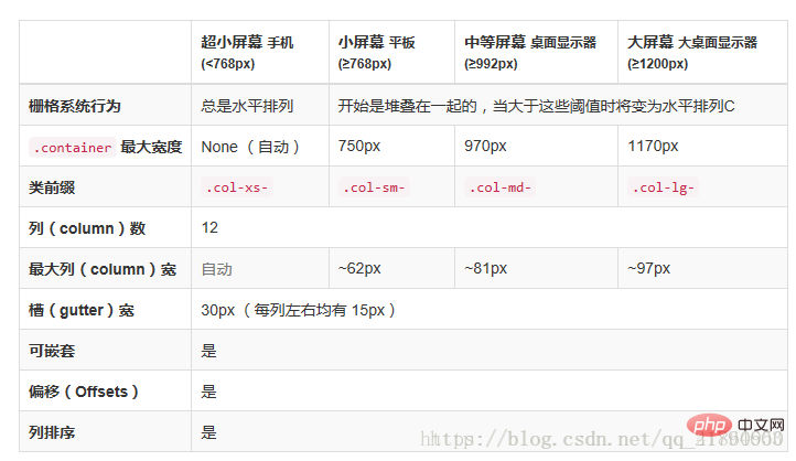
Using Bootstrap responsive layout,
First, you need to introduce the meta tag in the head, add the viewpirt attribute, the width in the content is equal to the device width, initial-scale: the page is visible for the first time. The zoom level of the area. If the value is 1, the page will be displayed according to the actual size without any scaling; maximum-scale: the minimum ratio that the user is allowed to zoom to; user-scalable: whether the user can manually zoom. The code is as follows:
<meta name="viewport" content="width=device-width, initial-scale=1, maximum-scale=1, user-scalable=no">
<link rel="stylesheet" type="text/css" href="/stylesheets/bootstrap.min.css">
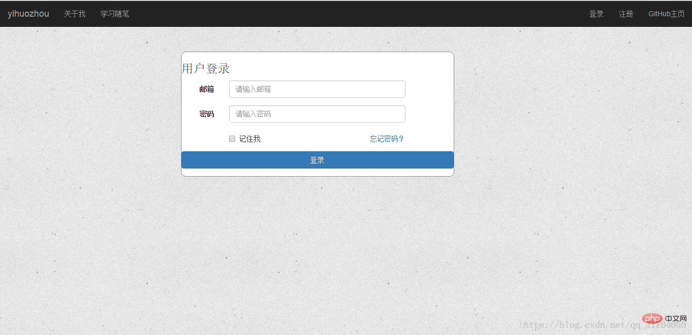
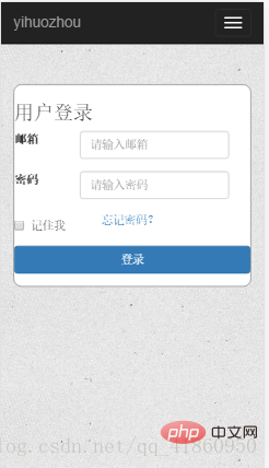
The following is a page (login form interface) using bootstrap layout, targeting ultra-small mobile phone screens (iphone5s) and PC screens (>=1200px). col-xs-12: small screen occupies 12 columns, col-lg-5: large screen occupies 5 columns, col-lg-offset-3: large screen indents 3 columns. This is a relatively simple example. If you want to adapt to other screens such as tablets, you can add the col-md-* attribute, and for large-screen phones, you can add the col-sm-* attribute. Which attribute to use for a specific screen can refer to the different uses of the Bootstrap grid system for different screens in the picture above.
<p class="container-fluid login">
  <p class="row">
    <p class="col-xs-12 col-sm-12 col-md-8 col-lg-5 col-lg-offset-3">
      <form class="form-horizontal loginForm">
        <h3 class="form-signin-heading">用戶登錄</h3>
        <p class="form-group">
          <label for="email" class="col-sm-2 col-xs-3 control-label">郵箱</label>
          <p class="col-sm-8 col-xs-8">
            <input type="text" class="form-control" name="email" placeholder="請輸入郵箱">
              <span class="glyphicon glyphicon-ok form-control-feedback" aria-hidden="true"></span>
            </p>
        </p>
        <p class="form-group">
          <label for="password" class="col-sm-2 col-xs-3 control-label">密碼</label>
          <p class="col-sm-8 col-xs-8">
            <input type="password" class="form-control" name="password" placeholder="請輸入密碼">
              <span class="glyphicon glyphicon-ok form-control-feedback" aria-hidden="true"></span>
            </p>
        </p>
        <p class="form-group">
          <p class="col-sm-offset-2 col-sm-4 col-xs-4 ">
            <p class="checkbox">
              <label>
                <input type="checkbox">記住我 </label>
            </p>
          </p>
          <p class="col-sm-4 col-xs-4 control-label" >
            <a href="resetPwd.html" id="forget">忘記密碼?</a>
          </p>
        </p>
        <p class="form-group">
          <p class="col-sm-12 col-lg-12">
            <button type="button" class="btn btn-primary btn-block" id="submit">登錄</button>
          </p>
        </p>
      </form>
    </p>
  </p>
Code renderings:
PC version:
Mobile version:
Related recommendations: bootstrap tutorial
The above is the detailed content of What is the principle of bootstrap to implement responsive layout?. For more information, please follow other related articles on the PHP Chinese website!

Hot AI Tools

Undress AI Tool
Undress images for free

Undresser.AI Undress
AI-powered app for creating realistic nude photos

AI Clothes Remover
Online AI tool for removing clothes from photos.

Clothoff.io
AI clothes remover

Video Face Swap
Swap faces in any video effortlessly with our completely free AI face swap tool!

Hot Article
Hot Tools

Notepad++7.3.1
Easy-to-use and free code editor

SublimeText3 Chinese version
Chinese version, very easy to use

Zend Studio 13.0.1
Powerful PHP integrated development environment

Dreamweaver CS6
Visual web development tools

SublimeText3 Mac version
God-level code editing software (SublimeText3)
Hot Topics


 How to use bootstrap in vue
Apr 07, 2025 pm 11:33 PM
How to use bootstrap in vue
Apr 07, 2025 pm 11:33 PM
Using Bootstrap in Vue.js is divided into five steps: Install Bootstrap. Import Bootstrap in main.js. Use the Bootstrap component directly in the template. Optional: Custom style. Optional: Use plug-ins.
 How to write split lines on bootstrap
Apr 07, 2025 pm 03:12 PM
How to write split lines on bootstrap
Apr 07, 2025 pm 03:12 PM
There are two ways to create a Bootstrap split line: using the tag, which creates a horizontal split line. Use the CSS border property to create custom style split lines.
 How to view the date of bootstrap
Apr 07, 2025 pm 03:03 PM
How to view the date of bootstrap
Apr 07, 2025 pm 03:03 PM
Answer: You can use the date picker component of Bootstrap to view dates in the page. Steps: Introduce the Bootstrap framework. Create a date selector input box in HTML. Bootstrap will automatically add styles to the selector. Use JavaScript to get the selected date.
 How to get the bootstrap search bar
Apr 07, 2025 pm 03:33 PM
How to get the bootstrap search bar
Apr 07, 2025 pm 03:33 PM
How to use Bootstrap to get the value of the search bar: Determines the ID or name of the search bar. Use JavaScript to get DOM elements. Gets the value of the element. Perform the required actions.
 How to verify bootstrap date
Apr 07, 2025 pm 03:06 PM
How to verify bootstrap date
Apr 07, 2025 pm 03:06 PM
To verify dates in Bootstrap, follow these steps: Introduce the required scripts and styles; initialize the date selector component; set the data-bv-date attribute to enable verification; configure verification rules (such as date formats, error messages, etc.); integrate the Bootstrap verification framework and automatically verify date input when form is submitted.
 How to use bootstrap button
Apr 07, 2025 pm 03:09 PM
How to use bootstrap button
Apr 07, 2025 pm 03:09 PM
How to use the Bootstrap button? Introduce Bootstrap CSS to create button elements and add Bootstrap button class to add button text
 How to set up the framework for bootstrap
Apr 07, 2025 pm 03:27 PM
How to set up the framework for bootstrap
Apr 07, 2025 pm 03:27 PM
To set up the Bootstrap framework, you need to follow these steps: 1. Reference the Bootstrap file via CDN; 2. Download and host the file on your own server; 3. Include the Bootstrap file in HTML; 4. Compile Sass/Less as needed; 5. Import a custom file (optional). Once setup is complete, you can use Bootstrap's grid systems, components, and styles to create responsive websites and applications.
 10 latest tools for web developers
May 07, 2025 pm 04:48 PM
10 latest tools for web developers
May 07, 2025 pm 04:48 PM
Web development design is a promising career field. However, this industry also faces many challenges. As more businesses and brands turn to the online marketplace, web developers have the opportunity to demonstrate their skills and succeed in their careers. However, as demand for web development continues to grow, the number of developers is also increasing, resulting in increasingly fierce competition. But it’s exciting that if you have the talent and will, you can always find new ways to create unique designs and ideas. As a web developer, you may need to keep looking for new tools and resources. These new tools and resources not only make your job more convenient, but also improve the quality of your work, thus helping you win more business and customers. The trends of web development are constantly changing.
