Found a total of 10000 related content

How to make a parallax scrolling effect with HTML5?
Article Introduction:To realize the parallax scrolling effect in HTML5, you need to combine HTML, CSS and JavaScript. The core is to allow different page elements to scroll at different speeds. 1. The HTML structure should contain multiple independent layers, such as using different class names to represent background, intermediate content and foreground. 2. CSS uses position:absolute and translateZ to create a 3D depth sense. The smaller the value of the background layer, the slower the scrolling. 3. JavaScript can listen to scroll events, dynamically adjust the translateY value, and control the scroll speed of each layer by multiplying by a coefficient. 4. Pay attention to performance optimization and use requestAnimationFrame
2025-07-15
comment 0
728
12 jQuery Fullscreen Plugins
Article Introduction:12 amazing jQuery full screen plug-ins to create a fascinating website!
Sometimes, full-screen websites are really cool! If a website looks plain, how long do you think visitors will stay? So, we have prepared some good stuff to help you: 12 jQuery full-screen plugins that give your website a stunning full-screen responsive effect! These plugins will add extraordinary visuals to your website. Ready?
Related recommendations:
100 jQuery picture/content slider plug-ins
30 jQuery responsive layout plug-ins
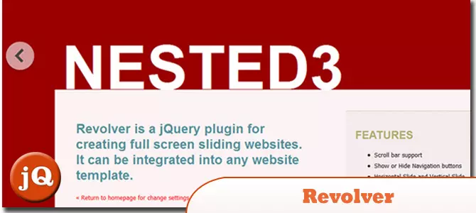
Revolver
A jQuery plugin for creating full-screen sliding websites. It can be integrated into any website template.
Source code
2025-02-25
comment 0
563
Implementing advanced layouts with CSS Grid techniques
Article Introduction:To use CSSGrid to implement advanced layouts, the key is to master its structural control and positioning methods. First, use grid-template-areas to build a semantic layout, such as the "head sidebar content area bottom" structure; second, through grid-column and grid-row, the element position can be accurately controlled, so that the card can span multiple columns or rows; then, combine minmax() and auto-fit to create a responsive grid, and automatically adjust the number of columns; finally, use cascade layout and z-index to control the element level to achieve a floating effect. These techniques can address complex and responsive web design needs.
2025-07-14
comment 0
654

How to use computed properties with Composition API?
Article Introduction:In Vue3's Composition API, the computed function can be used to implement responsive computed properties; 1. The basic writing method is to pass a function that returns a value to create read-only properties, such as computed(()=>count.value*2); 2. When it is necessary to be readable and writable, you can use the object form with get and set, such as updating the firstName and lastName by assigning fullName.value; 3. There is no need to add .value when used in the template, Vue will automatically unpack; computed is more suitable for derived values, and watch is suitable for side effect operations. Reasonable choice can improve the simplicity of the code and the clarity of responsive logic.
2025-07-03
comment 0
602
5 jQuery Background Video Plugins
Article Introduction:Five excellent jQuery background video plug-ins are recommended to easily create a cool website!
Many websites use pictures as backgrounds, and the effect is very cool. Since you can use pictures, why not use videos? This article will recommend five powerful jQuery background video plug-ins to help you easily videotape your website or blog background! Ready? Let's get started! Related readings:
Top 10 jQuery and HTML5 media players
jQuery parallax tutorial—animation title background
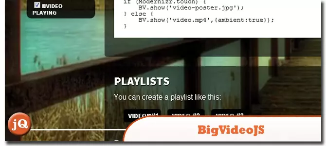
BIGVIDEO.JS
This plugin makes it a breeze to add adaptively populated background videos. It can play muted atmosphere background video (or a series of videos) or it can also be used as a player to display video playback
2025-02-25
comment 0
782

What is H5?
Article Introduction:H5, the abbreviation of HTML5, is a web development technology that supports mobile adaptation, touch interaction and multimedia functions. It is widely used in scenarios such as corporate publicity, marketing activities, data collection and education and training, such as fun tests, raffle pages, questionnaires and online courses. Compared with traditional web pages, H5 is more suitable for mobile browsing, and has responsive layout, offline caching and device information acquisition capabilities. The production of H5 can be quickly built through template platforms such as "Yiqixiu" and "Ruzhan", or developed by itself through HTML, CSS, JavaScript and other technologies, and attention should be paid to loading speed and compatibility testing.
2025-07-09
comment 0
306

How to make a responsive website with HTML5 and CSS3?
Article Introduction:The key to making a responsive website lies in the reasonable cooperation between HTML5 and CSS3, and the core is to make web pages display well on different devices. 1. Use HTML5 semantic tags to build clear structures, such as, , etc., to make the code easier to read and facilitate search engine crawling; 2. Use CSS3 media query to achieve multi-device adaptation, and apply different rules by detecting screen width, such as setting breakpoints such as mobile phones and tablets; 3. Use elastic layout (Flexbox or Grid) to deal with alignment and arrangement issues, and ensure that the navigation bar and other content automatically adapt to the screen; 4. Set image adaptation, use max-width:100% and srcset attributes to ensure that the image does not destroy the layout and improve the loading effect. Mastering these four key points can achieve compatibility with multiple settings
2025-07-13
comment 0
498

Using HTML5 Source Set for Responsive Images (srcset)
Article Introduction:How to implement responsive image loading on different devices? Use HTML5's srcset and sizes properties. The specific methods are: 1. Prepare pictures of multiple sizes and mark the width with w units; 2. Define the viewport ratio of pictures under different screen widths in sizes, such as (max-width: 600px)100vw; 3. Pay attention to setting DPR high-definition adaptation, such as 1x/2x descriptor; 4. Always keep src as a compatibility solution; 5. Plan the image size according to the device breakpoint, such as 480px/768px/1024px, etc.; 6. Test the loading effect of each size through the developer tool. This ensures that the browser accurately selects the best picture, taking into account loading speed and display quality.
2025-07-05
comment 0
437


Dave The Diver: How To Catch Spider Crabs
Article Introduction:In Dave The Diver, there are some creatures that are not easy to catch. Or, catch alive that is. The spider crab is one of those very species, making it seem like the only way to bring these crustaceans back up to land is to viciously crack them up w
2025-01-10
comment 0
819

Prepare for Interview Like a Pro with Interview Questions CLI
Article Introduction:Prepare for Interview Like a Pro with Interview Questions CLI
What is the Interview Questions CLI?
The Interview Questions CLI is a command-line tool designed for JavaScript learners and developers who want to enhance their interview
2025-01-10
comment 0
1445

Soft Deletes in Databases: To Use or Not to Use?
Article Introduction:Soft Deletes: A Question of DesignThe topic of soft deletes, a mechanism that "flags" records as deleted instead of physically removing them, has...
2025-01-10
comment 0
1056


