

HTML5 responsive design company template
All resources on this site are contributed by netizens or reprinted by major download sites. Please check the integrity of the software yourself! All resources on this site are for learning reference only. Please do not use them for commercial purposes. Otherwise, you will be responsible for all consequences! If there is any infringement, please contact us to delete it. Contact information: admin@php.cn
Related Article
 Applying HTML5 Principles to Responsive Web Design
15 Jul 2025
HTML5 improves responsive design through semantic tags, viewport control, responsive pictures and form optimization. 1. Use semantic tags such as, etc. to improve structural clarity, making it easier to flexibly arrange content blocks according to different devices; 2. By controlling mobile display, ensure that the page is correctly scaled and improve the mobile experience; 3. Use responsive image loading with tags, load adaptive resources according to screen size, and improve performance; 4. Use HTML5 form types such as email and tel to optimize mobile input, trigger the corresponding keyboard to improve user experience.
 How to create a responsive design with HTML5
18 Aug 2025
The key to creating a responsive design is to combine HTML5 structure and CSS. First, you must add a viewport meta tag to ensure the page is scaled correctly. Then use HTML5 semantic tags such as header, nav, main, etc. to build a clear document structure. Then, you can achieve flexible layout through the relative units, Flexbox or Grid layout in CSS, adjust the style for different screen sizes in combination with media queries, and finally set the max-width:100% of img and optimize the image display using picture elements to achieve a responsive website that is adapted to the entire device.
 How does the element help in responsive design in HTML5?
18 Aug 2025
Theviewportmetatagisessentialforresponsivedesignbecauseitensuresproperscalingandlayoutonmobiledevices;1.Itsetsthepagewidthtomatchthedevicescreenwith"width=device-width";2.Itsetstheinitialzoomlevelto1,preventingunwantedscalingwith"initi
 What is the meta viewport tag for responsive design in HTML5?
29 Aug 2025
Themetaviewporttagisessentialforresponsivedesignbecauseitensureswebpagesareproperlyscaledonmobiledevices;2.Itsetsthepagewidthtomatchthedevicescreenwidthwith"width=device-width";3.Itsetstheinitialzoomlevelto1.0with"initial-scale=1.0&quo
 How Can I Customize Bootstrap CSS Effectively While Maintaining Easy Updates?
21 Dec 2024
Customizing Bootstrap CSS Template: Best PracticesCustomizing Bootstrap can empower developers to enhance their websites'...
 Why Isn't My Bootstrap 3 Sticky Footer Sticking?
08 Dec 2024
Mastering the Twitter Bootstrap 3 Sticky FooterQuestion:Despite utilizing the Twitter Bootstrap 3 starter template, the sticky footer refuses to...
 How Can I Customize a Bootstrap CSS Template Without Breaking Future Updates?
24 Dec 2024
Customizing Bootstrap CSS Template Without HasslesAs a developer exploring Bootstrap, customizing it for specific project needs can be daunting....
 How to use bootstrap in vue
07 Apr 2025
Using Bootstrap in Vue.js is divided into five steps: Install Bootstrap. Import Bootstrap in main.js. Use the Bootstrap component directly in the template. Optional: Custom style. Optional: Use plug-ins.
 Can I Nest a `` Inside a `` in a Bootstrap Form?
13 Nov 2024
Nest Div Inside Label in Bootstrap FormWhen using Bootstrap for creating horizontal forms, the default template frequently assigns IDs to each...


Hot Tools
Bootstrap video website template
Bootstrap video website template is a movie website template download based on HTML5+CSS3.
Fashion trend waterfall flow layout responsive website bootstrap template
Fashion trend waterfall flow layout responsive website bootstrap template free download
Literary and concise VI design company corporate responsive official website
Literary and simple VI design company corporate responsive official website template free download
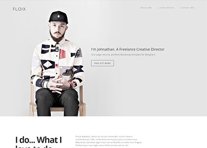
FLOIX Industrial Designer Studio official website template
FLOIX industrial designer studio official website template free download