


This tutorial shows you how to create and customize bar graphs in Excel, including sorting data automatically. We'll cover creating various bar chart types, adjusting bar width and colors, and handling negative values.
Bar graphs, alongside pie charts, are frequently used for comparing numerical data like percentages, frequencies, or measurements across different categories. A specialized bar graph, the Gantt chart, is common in project management.
This tutorial explores:
- Bar chart fundamentals
- Creating bar charts in Excel
- Different bar chart types
- Customization:
- Adjusting bar width and spacing
- Handling negative values
- Sorting data in bar charts
Bar Chart Basics
A bar graph (or bar chart) uses rectangular bars to represent data categories, with bar lengths proportional to the data values. They can be vertical or horizontal (vertical bar graphs are called column charts in Excel).
The image below shows a standard 2-D clustered bar chart with three data series (grey, green, blue) and four categories (Jan-Apr).

Creating Bar Charts in Excel
Creating a bar chart is straightforward: select your data, go to the "Insert" tab, and choose your desired bar chart type from the "Charts" group.
The image below shows creating a standard 2-D bar chart.

The resulting chart (shown below) displays one data series if your data has a single numerical column; multiple columns create multiple data series, each with a different color.


To view all available bar chart types, click "More Column Charts..." and select from the subtypes. Adjust layout and style using the "Design" tab's "Quick Layout" and "Chart Styles" options.


Excel Bar Chart Types
Excel offers several bar chart subtypes:
-
Clustered Bar Charts: Compare values across categories.

-
Stacked Bar Charts: Show the proportion of individual items to the whole.
-
100% Stacked Bar Charts: Show the percentage contribution of each value to the total in each category.
-
Cylinder, Cone, and Pyramid Charts: Similar to rectangular bar charts, but with different shapes. In Excel 2013 and later, create a 3-D bar chart and then change the column shape in the "Format Data Series" pane.


Customizing Bar Graphs
Customize your chart title, axes, data labels, legend, gridlines, and more using standard Excel chart formatting options.
Changing Bar Width and Spacing
Right-click a data series, choose "Format Data Series...", and adjust the "Gap Width" and "Series Overlap" (2-D) or "Gap Depth" (3-D) sliders to control bar width and spacing.


Bar Charts with Negative Values
Excel handles negative values, but you may need to adjust the vertical axis label position ("Low" in "Format Axis...") and use different colors for negative bars ("Invert if Negative" in "Format Data Series...").


Sorting Data on Bar Charts
By default, Excel reverses the order of data categories in bar charts. To sort correctly, sort your source data accordingly (ascending for ascending order on the chart, and vice versa).


To sort without changing source data, in "Format Axis...", select "At maximum category" and "Categories in reverse order". This also affects data series order.


To reorder data series independently, use the "Select Data Source" dialog or edit data series formulas.


This comprehensive guide helps you master Excel bar graph creation and customization.
The above is the detailed content of How to make a bar graph in Excel. For more information, please follow other related articles on the PHP Chinese website!

Hot AI Tools

Undress AI Tool
Undress images for free

Undresser.AI Undress
AI-powered app for creating realistic nude photos

AI Clothes Remover
Online AI tool for removing clothes from photos.

Clothoff.io
AI clothes remover

Video Face Swap
Swap faces in any video effortlessly with our completely free AI face swap tool!

Hot Article
Hot Tools

Notepad++7.3.1
Easy-to-use and free code editor

SublimeText3 Chinese version
Chinese version, very easy to use

Zend Studio 13.0.1
Powerful PHP integrated development environment

Dreamweaver CS6
Visual web development tools

SublimeText3 Mac version
God-level code editing software (SublimeText3)
Hot Topics


 How to Use Parentheses, Square Brackets, and Curly Braces in Microsoft Excel
Jun 19, 2025 am 03:03 AM
How to Use Parentheses, Square Brackets, and Curly Braces in Microsoft Excel
Jun 19, 2025 am 03:03 AM
Quick Links Parentheses: Controlling the Order of Opera
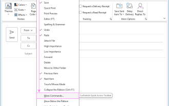 Outlook Quick Access Toolbar: customize, move, hide and show
Jun 18, 2025 am 11:01 AM
Outlook Quick Access Toolbar: customize, move, hide and show
Jun 18, 2025 am 11:01 AM
This guide will walk you through how to customize, move, hide, and show the Quick Access Toolbar, helping you shape your Outlook workspace to fit your daily routine and preferences. The Quick Access Toolbar in Microsoft Outlook is a usefu
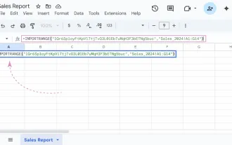 Google Sheets IMPORTRANGE: The Complete Guide
Jun 18, 2025 am 09:54 AM
Google Sheets IMPORTRANGE: The Complete Guide
Jun 18, 2025 am 09:54 AM
Ever played the "just one quick copy-paste" game with Google Sheets... and lost an hour of your life? What starts as a simple data transfer quickly snowballs into a nightmare when working with dynamic information. Those "quick fixes&qu
 Don't Ignore the Power of F9 in Microsoft Excel
Jun 21, 2025 am 06:23 AM
Don't Ignore the Power of F9 in Microsoft Excel
Jun 21, 2025 am 06:23 AM
Quick LinksRecalculating Formulas in Manual Calculation ModeDebugging Complex FormulasMinimizing the Excel WindowMicrosoft Excel has so many keyboard shortcuts that it can sometimes be difficult to remember the most useful. One of the most overlooked
 6 Cool Right-Click Tricks in Microsoft Excel
Jun 24, 2025 am 12:55 AM
6 Cool Right-Click Tricks in Microsoft Excel
Jun 24, 2025 am 12:55 AM
Quick Links Copy, Move, and Link Cell Elements
 Prove Your Real-World Microsoft Excel Skills With the How-To Geek Test (Advanced)
Jun 17, 2025 pm 02:44 PM
Prove Your Real-World Microsoft Excel Skills With the How-To Geek Test (Advanced)
Jun 17, 2025 pm 02:44 PM
Whether you've recently taken a Microsoft Excel course or you want to verify that your knowledge of the program is current, try out the How-To Geek Advanced Excel Test and find out how well you do!This is the third in a three-part series. The first i
 How to recover unsaved Word document
Jun 27, 2025 am 11:36 AM
How to recover unsaved Word document
Jun 27, 2025 am 11:36 AM
1. Check the automatic recovery folder, open "Recover Unsaved Documents" in Word or enter the C:\Users\Users\Username\AppData\Roaming\Microsoft\Word path to find the .asd ending file; 2. Find temporary files or use OneDrive historical version, enter ~$ file name.docx in the original directory to see if it exists or log in to OneDrive to view the version history; 3. Use Windows' "Previous Versions" function or third-party tools such as Recuva and EaseUS to scan and restore and completely delete files. The above methods can improve the recovery success rate, but you need to operate as soon as possible and avoid writing new data. Automatic saving, regular saving or cloud use should be enabled
 5 New Microsoft Excel Features to Try in July 2025
Jul 02, 2025 am 03:02 AM
5 New Microsoft Excel Features to Try in July 2025
Jul 02, 2025 am 03:02 AM
Quick Links Let Copilot Determine Which Table to Manipu
