


The key to making histograms in Excel is preparing data, inserting charts, and adjusting interval settings. First, make sure that the data is a column of clean numerical data without mixing other information; then click "Insert" to select the histogram type to generate a chart; then adjust the bin by right-clicking the axis format, you can choose to divide the intervals automatically, by width or by quantity, or customize the boundary values; finally pay attention to the details of the chart such as title, axis label, color, etc. to improve readability. The whole process is simple but attention should be paid to the details to ensure the chart is clear and accurate.

It is not difficult to make a histogram in Excel. The key is to know how to prepare data, how to select charts, and don’t make mistakes in settings. Excel provides ready-made tools, you don’t have to calculate intervals one by one by one. As long as you operate it properly, you can do it in a few strokes.

Data preparation is the first step
Before making a histogram, make sure your data is sorted out. Generally speaking, you need a column of numerical data, such as continuous data such as sales, grades, and height.
- The data should be clean : there is no null or non-numeric content, otherwise the chart may go wrong.
- It is recommended to put a single column : do not mix other irrelevant information, so as to facilitate subsequent selection and processing.
- There is no need to group in advance : Excel will automatically help you count the frequency by interval, unless you have specific interval division requirements.
The method of inserting a histogram is simple
Since Excel 2016, histograms have become one of the built-in chart types, and the operation paths are very intuitive:
- Select your data column
- Click "Insert" on the menu bar
- Find "Histogram" in the "Chart" area and click Insert
At this time you will see a histogram of default grouping. If this result does not meet expectations, you can continue to adjust the settings.
Adjust interval settings to make the chart clearer
The default interval division may not be appropriate. At this time, you can manually modify the bin (interval) settings:
- Right-click on the horizontal axis → select "Set the axis format"
- In the right panel, you can choose:
- Automatic: Let Excel decide the range
- By width: Set the span of each interval (for example, every 10 is divided into one interval)
- By quantity: specify several intervals
If you have your own interval boundary value, you can also create a new bin data column and specify it in the chart settings.
For example: If you want to divide the scores into 0-60, 60-70, 70-80, 80-90, 90-100, you can write these boundaries in a column, and then check "Overflow" and "Unflow" in "Set Data Series Format" to control extreme values.
Tips: Don't ignore chart details
Although the picture is out, it sometimes looks weird, maybe it is because these places are not paid attention to:
- Is the horizontal axis label too dense? You can adjust the interval width appropriately, or delete some extremely small bins.
- The chart title and axis name are not written? Double-click the corresponding position to edit it, and adding instructions will make it easier for others to understand.
- Too monotonous? Right-clicking the post can change the fill color or border to improve readability.
Basically these are the steps. The whole process is not complicated, but some settings are easy to ignore, especially the way bin is divided, which will affect the final effect.
The above is the detailed content of how to create a histogram in excel. For more information, please follow other related articles on the PHP Chinese website!

Hot AI Tools

Undress AI Tool
Undress images for free

Undresser.AI Undress
AI-powered app for creating realistic nude photos

AI Clothes Remover
Online AI tool for removing clothes from photos.

Clothoff.io
AI clothes remover

Video Face Swap
Swap faces in any video effortlessly with our completely free AI face swap tool!

Hot Article
Hot Tools

Notepad++7.3.1
Easy-to-use and free code editor

SublimeText3 Chinese version
Chinese version, very easy to use

Zend Studio 13.0.1
Powerful PHP integrated development environment

Dreamweaver CS6
Visual web development tools

SublimeText3 Mac version
God-level code editing software (SublimeText3)
Hot Topics


 How to Use Parentheses, Square Brackets, and Curly Braces in Microsoft Excel
Jun 19, 2025 am 03:03 AM
How to Use Parentheses, Square Brackets, and Curly Braces in Microsoft Excel
Jun 19, 2025 am 03:03 AM
Quick Links Parentheses: Controlling the Order of Opera
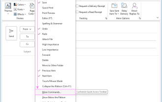 Outlook Quick Access Toolbar: customize, move, hide and show
Jun 18, 2025 am 11:01 AM
Outlook Quick Access Toolbar: customize, move, hide and show
Jun 18, 2025 am 11:01 AM
This guide will walk you through how to customize, move, hide, and show the Quick Access Toolbar, helping you shape your Outlook workspace to fit your daily routine and preferences. The Quick Access Toolbar in Microsoft Outlook is a usefu
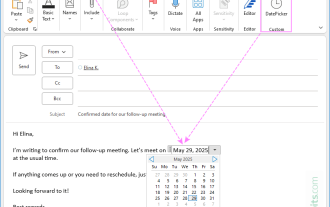 How to insert date picker in Outlook emails and templates
Jun 13, 2025 am 11:02 AM
How to insert date picker in Outlook emails and templates
Jun 13, 2025 am 11:02 AM
Want to insert dates quickly in Outlook? Whether you're composing a one-off email, meeting invite, or reusable template, this guide shows you how to add a clickable date picker that saves you time. Adding a calendar popup to Outlook email
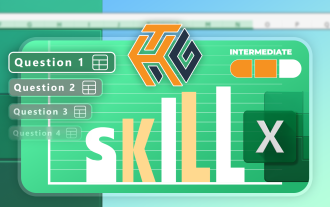 Prove Your Real-World Microsoft Excel Skills With the How-To Geek Test (Intermediate)
Jun 14, 2025 am 03:02 AM
Prove Your Real-World Microsoft Excel Skills With the How-To Geek Test (Intermediate)
Jun 14, 2025 am 03:02 AM
Whether you've secured a data-focused job promotion or recently picked up some new Microsoft Excel techniques, challenge yourself with the How-To Geek Intermediate Excel Test to evaluate your proficiency!This is the second in a three-part series. The
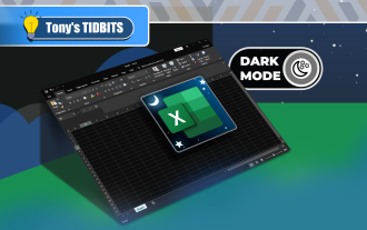 How to Switch to Dark Mode in Microsoft Excel
Jun 13, 2025 am 03:04 AM
How to Switch to Dark Mode in Microsoft Excel
Jun 13, 2025 am 03:04 AM
More and more users are enabling dark mode on their devices, particularly in apps like Excel that feature a lot of white elements. If your eyes are sensitive to bright screens, you spend long hours working in Excel, or you often work after dark, swit
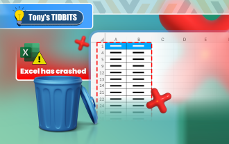 How to Delete Rows from a Filtered Range Without Crashing Excel
Jun 14, 2025 am 12:53 AM
How to Delete Rows from a Filtered Range Without Crashing Excel
Jun 14, 2025 am 12:53 AM
Quick LinksWhy Deleting Filtered Rows Crashes ExcelSort the Data First to Prevent Excel From CrashingRemoving rows from a large filtered range in Microsoft Excel can be time-consuming, cause the program to temporarily become unresponsive, or even lea
 Google Sheets IMPORTRANGE: The Complete Guide
Jun 18, 2025 am 09:54 AM
Google Sheets IMPORTRANGE: The Complete Guide
Jun 18, 2025 am 09:54 AM
Ever played the "just one quick copy-paste" game with Google Sheets... and lost an hour of your life? What starts as a simple data transfer quickly snowballs into a nightmare when working with dynamic information. Those "quick fixes&qu
 6 Cool Right-Click Tricks in Microsoft Excel
Jun 24, 2025 am 12:55 AM
6 Cool Right-Click Tricks in Microsoft Excel
Jun 24, 2025 am 12:55 AM
Quick Links Copy, Move, and Link Cell Elements
