
 Common Problem
Angular components and their display properties: understanding non-block default values
Common Problem
Angular components and their display properties: understanding non-block default values
Angular components and their display properties: understanding non-block default values
Mar 15, 2024 pm 04:51 PM
The default display behavior of components in the Angular framework is not block-level elements. This design choice promotes encapsulation of component styles and encourages developers to consciously define how each component is displayed. By explicitly setting the CSS property display, the display of Angular components can be fully controlled to achieve the desired layout and responsiveness.

Angular is a powerful framework for building dynamic web applications, known for its component-based architecture. display: block However, one aspect that often confuses new developers is that Angular components are unstyled by default. This article explores the implications of this design choice, its impact on web development, and how developers can use it effectively.
The world of front-end development is filled with frameworks designed to provide developers with powerful tools to build interactive and dynamic web applications.
Among them, Angular stands out as a powerful platform known for its comprehensive approach to building application architecture. Of particular note is the way Angular handles components - the basic building blocks of Angular applications.
1. Understanding Angular Components
In Angular, components are the basic building blocks that encapsulate data binding, logic, and template rendering. They play a crucial role in defining the structure and behavior of the application interface.
1. Definition and function
A component in Angular is a TypeScript class decorated with @Component(), where you can define its application logic. Accompanying this class is a template, usually an HTML file that determines the visual representation of the component, and optionally a CSS file for styling. The role of this component is multifaceted: it manages the data and state required by the view, handles user interaction, and can also be reused throughout the application.
import { Component } from '@angular/core';

@Component({
selector: 'app-my-component',
templateUrl: './my-component.component.html',
styleUrls: ['./my-component.component.css']
})
export class MyComponent {
// Component logic is placed here
}
2. Angular’s ??Shadow DOM
Angular components utilize a feature called Shadow DOM, which encapsulates their markup and styles to ensure that they Independent of other components. This means that styles defined in one component cannot leak and affect other parts of the application. Shadow DOM allows styles to be encapsulated by creating a border around components.
As a developer, you must understand the structure and functionality of Angular components in order to fully utilize the power of the framework. When considering how components are displayed and styled in an application, it's especially important to recognize the inherent encapsulation provided by Angular's Shadow DOM.
2. Display block: non-default values ??in Angular components
Angular components differ from standard HTML elements in many ways, one of which is their default display attribute . Unlike basic HTML elements, which usually have a block or inline display value, Angular components do not specify "none" as their default display behavior. This decision is intentional and plays an important role in Angular's philosophy of encapsulation and component rendering.
1. Comparison with HTML elements
Standard HTML elements (such as div, p, and ) h1 have a default style that can contain the CSS attribute display: block. This means that when you put an a inside a div tag, it will naturally take up the entire width available, creating a "block" on the page.
<!-- Standard HTML div element -->
<div>This div is a block-level element by default. </div>
In contrast, Angular components make no assumptions about their display properties when they are launched. That is, they do not behave inherently like block or inline elements; they do not behave inherently like block or inline elements. They are essentially "display independent" until specified.
2. The rationale behind non-block defaults
Angular's choice to deviate from the typical block behavior of HTML elements is well thought out. One of the reasons for this is to encourage developers to make conscious decisions about how each component should appear in the application layout. It prevents unexpected layout changes and global style overrides that can occur when components with block-level styles are introduced into existing content.
Since the display property is not set by default, Angular invites developers to think responsively and adapt their components to various screens by setting explicit display styles that suit the component's purpose in the application context. Size and layout requirements.
In the next section, we'll explore how to use the display properties of Angular components to ensure they fit seamlessly into your application design through clear and intentional styling choices.
3. Using Angular’s ??Display Styles
When building applications using Angular, understanding and correctly implementing display styles is critical to achieving the desired layout and responsiveness. . Because there are no preset display rules for Angular components, developers need to define how each component displays in the context of the application.
1. Explicitly set the display style
By explicitly setting CSS properties, you can fully control the display mode of Angular components. This can be defined inline in the component's stylesheet, or even dynamically via component logic.
/* app-example.component.css */
:host {
display: block;
}
<!-- Inline style --> <app-example-component style="display: block;"></app-example-component>
// Component logic settings are dynamically displayed
export class ExampleComponent implements OnInit {
@HostBinding('style.display')
displayStyle: string = 'block';
}
Choosing to style a component's display via a style sheet ensures that you can take advantage of the full power of CSS, including the responsiveness of media queries.
2. Responsive design considerations
Angular’s ??adaptability allows you to create responsive designs by combining explicit display styles with modern CSS techniques. Using media queries, Flexbox, and CSS Grid, you can responsively adjust the layout of your components based on the viewport size.
/* app-example.component.css */
:host {
display: grid;
grid-template-columns: repeat(auto-fill, minmax(150px, 1fr));
}

@media (max-width: 768px) {
:host {
Display: block;
}
}
You can create responsive and adaptive user interfaces by setting explicit display values ??in stylesheets and using Angular's data binding capabilities. This level of control over style reflects the thoughtfulness that Angular brings to the development process, enabling you to create complex, maintainable, and scalable applications.
Next, we’ll wrap up the discussion and revisit the key points of using Angular components and their display style strategies.
Conclusion
In this exploration of Angular components and their display properties, it becomes clear that Angular's choice to use the component's non-block default is a purposeful design decision. This approach promotes more thoughtful style application and supports encapsulation, a core principle in Angular architecture. It guides developers to make intentional and adaptive layouts that are a must for different devices and screen sizes.
By understanding Angular’s ??component architecture and the reasoning behind its display style choices, developers are better able to make informed decisions. Explicit display settings and responsive design considerations are not an afterthought but an integral part of the design and development process when using Angular.
Embracing these concepts enables developers to take full advantage of the framework's capabilities, resulting in well-structured, maintainable, and responsive applications that can withstand the test of time and technological advancements. The information provided in this article is intended to guide Angular developers in effectively utilizing these tools to ensure that the user experiences they create are as powerful as the components they contain.
The above is the detailed content of Angular components and their display properties: understanding non-block default values. For more information, please follow other related articles on the PHP Chinese website!

Hot AI Tools

Undress AI Tool
Undress images for free

Undresser.AI Undress
AI-powered app for creating realistic nude photos

AI Clothes Remover
Online AI tool for removing clothes from photos.

Clothoff.io
AI clothes remover

Video Face Swap
Swap faces in any video effortlessly with our completely free AI face swap tool!

Hot Article
Hot Tools

Notepad++7.3.1
Easy-to-use and free code editor

SublimeText3 Chinese version
Chinese version, very easy to use

Zend Studio 13.0.1
Powerful PHP integrated development environment

Dreamweaver CS6
Visual web development tools

SublimeText3 Mac version
God-level code editing software (SublimeText3)
Hot Topics


 How to install the Windows 10 old version component DirectPlay
Dec 28, 2023 pm 03:43 PM
How to install the Windows 10 old version component DirectPlay
Dec 28, 2023 pm 03:43 PM
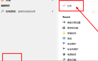
Many users always encounter some problems when playing some games on win10, such as screen freezes and blurred screens. At this time, we can solve the problem by turning on the directplay function, and the operation method of the function is also Very simple. How to install directplay, the old component of win10 1. Enter "Control Panel" in the search box and open it 2. Select large icons as the viewing method 3. Find "Programs and Features" 4. Click on the left to enable or turn off win functions 5. Select the old version here Just check the box
 How to install Angular on Ubuntu 24.04
Mar 23, 2024 pm 12:20 PM
How to install Angular on Ubuntu 24.04
Mar 23, 2024 pm 12:20 PM
Angular.js is a freely accessible JavaScript platform for creating dynamic applications. It allows you to express various aspects of your application quickly and clearly by extending the syntax of HTML as a template language. Angular.js provides a range of tools to help you write, update and test your code. Additionally, it provides many features such as routing and form management. This guide will discuss how to install Angular on Ubuntu24. First, you need to install Node.js. Node.js is a JavaScript running environment based on the ChromeV8 engine that allows you to run JavaScript code on the server side. To be in Ub
 What does groove mean in css
Apr 28, 2024 pm 04:12 PM
What does groove mean in css
Apr 28, 2024 pm 04:12 PM
In CSS, groove represents a border style that creates a groove-like effect. The specific application is as follows: Use the CSS property border-style: groove; the groove-shaped border has a concave inner edge, a raised outer edge and a shadow effect.
 How to open the settings of the old version of win10 components
Dec 22, 2023 am 08:45 AM
How to open the settings of the old version of win10 components
Dec 22, 2023 am 08:45 AM
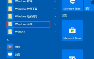
Win10 old version components need to be turned on by users themselves in the settings, because many components are usually closed by default. First we need to enter the settings. The operation is very simple. Just follow the steps below. Where are the win10 old version components? Open 1. Click Start, then click "Win System" 2. Click to enter the Control Panel 3. Then click the program below 4. Click "Enable or turn off Win functions" 5. Here you can choose what you want to open
 Angular components and their display properties: understanding non-block default values
Mar 15, 2024 pm 04:51 PM
Angular components and their display properties: understanding non-block default values
Mar 15, 2024 pm 04:51 PM
The default display behavior for components in the Angular framework is not for block-level elements. This design choice promotes encapsulation of component styles and encourages developers to consciously define how each component is displayed. By explicitly setting the CSS property display, the display of Angular components can be fully controlled to achieve the desired layout and responsiveness.
 The key optimization mode to improve website speed, every front-end developer must master!
Feb 02, 2024 pm 05:36 PM
The key optimization mode to improve website speed, every front-end developer must master!
Feb 02, 2024 pm 05:36 PM
A must-have for front-end developers: master these optimization modes and make your website fly! With the rapid development of the Internet, websites have become one of the important channels for corporate promotion and communication. A well-performing, fast-loading website not only improves user experience, but also attracts more visitors. As a front-end developer, it is essential to master some optimization patterns. This article will introduce some commonly used front-end optimization techniques to help developers better optimize their websites. Compressed files In website development, commonly used file types include HTML, CSS and J
 Vue component practice: paging component development
Nov 24, 2023 am 08:56 AM
Vue component practice: paging component development
Nov 24, 2023 am 08:56 AM
Vue component practice: Introduction to paging component development In web applications, the paging function is an essential component. A good paging component should be simple and clear in presentation, rich in functions, and easy to integrate and use. In this article, we will introduce how to use the Vue.js framework to develop a highly customizable paging component. We will explain in detail how to develop using Vue components through code examples. Technology stack Vue.js2.xJavaScript (ES6) HTML5 and CSS3 development environment
 Vue component development: implementation method of progress bar component
Nov 24, 2023 am 08:56 AM
Vue component development: implementation method of progress bar component
Nov 24, 2023 am 08:56 AM
Vue component development: Progress bar component implementation method Preface: In Web development, the progress bar is a common UI component, often used to display the progress of operations in scenarios such as data requests, file uploads, and form submissions. In Vue.js, we can easily implement a progress bar component by customizing components. This article will introduce an implementation method and provide specific code examples. I hope it will be helpful to Vue.js beginners. Component structure and style First, we need to define the basic structure and style of the progress bar component.